Gaia' Garden
" height="9.976935876965042px" id="jM9KX23vu" transform="translate(27 12.5)" width="17.009821060712284px"/><path d="M 5.838 0.565 C 3.428 2.794 1.456 5.456 0.025 8.411 C -0.168 8.805 0.805 8.7 0.942 8.676 C 1.337 8.603 2.066 8.449 2.268 8.026 C 3.652 5.161 5.564 2.582 7.902 0.425 C 8.292 0.065 7.564 -0.013 7.357 0.002 C 6.844 0.031 6.227 0.199 5.837 0.56 L 5.837 0.565 Z" fill="rgb(64, 89, 49)" height="8.70636676391473px" id="UuxbLLJgG" transform="translate(35.5 14)" width="8.015254571864489px"/><path d="M 60.591 7.991 C 47.922 0.962 24.641 -3.495 5.188 3.564 L 5.028 3.636 C 4.882 3.711 4.759 3.826 4.674 3.967 C 4.557 4.161 4.562 4.404 4.687 4.593 C 4.814 4.786 5.033 4.887 5.246 4.925 C 5.464 4.963 5.713 4.943 5.948 4.861 L 5.951 4.861 C 24.991 -2.05 47.831 2.566 59.894 9.52 C 62.654 11.114 66.18 13.69 68.248 16.725 C 69.26 18.202 69.911 19.774 69.948 21.382 C 69.984 22.983 69.412 24.651 67.923 26.329 C 64.7 29.962 59.77 31.249 56.073 32.446 L 56.072 32.446 C 47.83 35.124 38.02 35.67 28.92 34.502 C 19.815 33.333 11.455 30.452 6.1 26.31 C 2.677 23.654 1.51 20.696 2.153 17.77 C 2.801 14.816 5.306 11.817 9.401 9.142 C 11.751 7.608 14.091 6.212 17.108 5.556 L 17.721 5.436 C 17.95 5.394 18.163 5.29 18.313 5.145 C 18.456 5.006 18.567 4.799 18.518 4.565 C 18.483 4.315 18.288 4.157 18.094 4.078 C 17.876 3.995 17.64 3.975 17.411 4.018 C 13.701 4.68 10.883 6.302 8.176 8.082 L 8.177 8.082 C 3.725 10.989 0.913 14.311 0.187 17.679 C -0.545 21.074 0.857 24.439 4.65 27.378 C 10.27 31.734 19.005 34.723 28.462 35.931 C 37.924 37.138 48.14 36.568 56.734 33.774 C 60.604 32.518 66.002 31.061 69.537 27.063 L 69.538 27.062 C 70.885 25.531 71.602 23.979 71.821 22.446 C 72.041 20.913 71.761 19.416 71.147 17.996 L 71.147 17.994 C 70.244 15.921 68.613 14.005 66.787 12.362 C 64.96 10.717 62.922 9.332 61.187 8.327 Z" fill="rgb(64, 89, 49)" height="36.52947865113197px" id="C8JbtENhC" stroke-dasharray="" stroke-linecap="butt" stroke-linejoin="miter" stroke-miterlimit="10" stroke-width="0.5" stroke="rgb(64, 89, 49)" width="71.89551202796224px"/></g></svg>)
" height="36.370963454509365px" id="jeyWhDi1K" stroke-dasharray="" stroke-linecap="butt" stroke-linejoin="miter" stroke-miterlimit="10" stroke-width="0.25" stroke="rgb(64, 89, 49)" width="117.9708956840584px"/><path d="M 0.062 6.964 C 0.555 13.488 0.539 20.045 0.002 26.564 C -0.064 27.392 1.948 27.331 2.03 26.547 C 2.546 21.504 1.767 15.862 4.344 11.251 C 4.634 10.731 4.964 10.231 5.336 9.766 C 5.566 9.476 6.066 8.762 6.487 8.746 C 7.343 8.713 6.833 10.901 6.696 11.306 C 6.098 13.083 4.355 14.749 2.392 14.76 C 1.959 14.76 1.317 14.87 1.18 15.369 C 1.054 15.824 1.586 16.147 1.98 16.142 C 4.152 16.131 6.137 15.232 7.535 13.559 C 8.181 12.781 8.675 11.822 8.872 10.829 C 9.07 9.837 9.141 8.603 8.324 7.896 C 7.441 7.129 6.044 7.244 5.078 7.781 C 4.113 8.318 3.362 9.333 2.781 10.259 C 1.526 12.271 0.884 14.596 0.583 16.931 C 0.183 20.067 0.331 23.241 0.007 26.383 L 2.036 26.366 C 2.569 19.845 2.587 13.291 2.09 6.766 C 2.02 5.84 -0.026 6.038 0.046 6.976 L 0.062 6.976 Z M 9.574 7.863 L 10.287 14.42 C 10.331 14.81 10.862 15.166 11.159 15.358 C 11.285 15.44 11.926 15.84 11.953 15.5 C 12.211 12.732 14.173 10.199 16.794 9.256 C 17.118 9.141 16.559 8.614 16.454 8.521 C 16.257 8.343 16.04 8.189 15.808 8.061 C 15.687 7.995 15.462 7.863 15.325 7.918 C 12.562 8.91 10.561 11.493 10.292 14.415 L 11.959 15.495 L 11.246 8.938 C 11.202 8.548 10.671 8.192 10.375 8 C 10.287 7.946 9.541 7.523 9.58 7.858 Z M 18.286 9.086 C 17.743 10.478 17.228 11.964 17.551 13.472 C 17.841 14.842 18.757 16.394 20.232 16.706 C 21.427 16.959 22.705 16.361 23.292 15.292 C 24.053 13.905 23.708 12.2 22.907 10.912 C 22.069 9.557 20.599 8.697 19.047 8.422 C 18.023 8.242 18.571 10.149 19.306 10.275 C 19.83 10.362 20.341 10.519 20.824 10.741 C 21.257 10.955 21.559 11.191 21.86 11.515 C 21.97 11.635 21.789 11.421 21.888 11.547 C 21.915 11.586 21.948 11.624 21.975 11.663 C 22.014 11.717 22.047 11.767 22.085 11.822 C 21.986 11.668 22.075 11.805 22.085 11.838 C 22.112 11.898 22.233 12.2 22.178 12.024 C 22.217 12.145 22.261 12.266 22.293 12.397 C 22.261 12.249 22.293 12.414 22.293 12.436 C 22.299 12.501 22.31 12.562 22.315 12.627 C 22.326 12.748 22.326 12.682 22.315 12.83 C 22.305 13.088 22.266 13.274 22.178 13.516 C 21.893 14.272 21.082 14.836 20.27 14.859 C 20.073 14.859 19.909 14.842 19.728 14.782 C 19.623 14.749 19.541 14.705 19.508 14.689 C 19.47 14.667 19.437 14.639 19.398 14.618 C 19.207 14.503 19.464 14.705 19.305 14.546 L 19.212 14.453 C 19.102 14.349 19.294 14.568 19.202 14.453 C 19.14 14.372 19.081 14.287 19.026 14.201 C 19.146 14.393 18.987 14.102 18.96 14.042 C 19.026 14.234 18.977 14.08 18.96 14.042 L 18.894 13.828 C 18.861 13.718 18.894 13.839 18.894 13.856 C 18.867 13.724 18.847 13.591 18.834 13.456 C 18.834 13.395 18.834 13.395 18.834 13.456 L 18.834 13.34 C 18.834 13.022 18.861 12.704 18.933 12.392 C 19.086 11.706 19.338 11.054 19.596 10.402 C 19.766 9.963 19.47 9.355 19.157 9.048 C 18.883 8.778 18.439 8.636 18.269 9.08 Z M 31.263 11.657 C 30.04 10.187 27.809 8.801 26.143 10.451 C 24.613 11.964 24.909 14.453 26.438 15.801 C 27.211 16.481 28.116 17.261 29.218 17.085 C 30.38 16.898 31.142 15.895 31.493 14.837 C 32.151 12.836 31.943 10.527 31.877 8.461 C 31.805 6.092 31.603 3.631 32.074 1.295 L 30.479 0.051 C 31.772 4.848 29.799 10.643 32.869 14.936 C 33.11 15.27 33.483 15.539 33.807 15.786 C 33.949 15.89 34.147 16.098 34.317 16.131 C 34.333 16.131 34.519 16.235 34.447 16.131 C 32.803 13.828 32.71 10.944 32.639 8.22 C 32.579 5.923 32.661 3.483 32.058 1.246 C 31.986 0.977 31.422 0.632 31.224 0.479 C 31.164 0.429 30.474 -0.037 30.468 0.002 C 29.798 3.291 30.358 6.762 30.314 10.089 C 30.292 11.679 30.254 13.609 29.168 14.881 C 28.9 15.193 28.565 15.451 28.193 15.616 C 27.977 15.713 27.747 15.777 27.513 15.807 C 27.453 15.813 26.673 15.714 26.673 15.714 C 26.783 15.599 27.283 16.449 27.189 16.076 C 27.167 15.999 27.09 15.901 27.052 15.829 C 26.967 15.657 26.899 15.477 26.849 15.292 C 26.727 14.84 26.696 14.369 26.756 13.905 C 26.86 12.984 27.276 12.057 28.034 11.487 C 28.39 11.218 28.812 11.049 29.256 10.999 C 29.503 10.972 29.749 10.977 29.996 11.021 C 30.084 11.038 30.166 11.06 30.248 11.081 C 30.802 11.246 30.534 11.481 29.815 10.626 C 30.111 10.977 30.512 11.273 30.89 11.536 C 30.972 11.596 31.515 11.953 31.268 11.657 Z M 34.486 9.689 C 34.36 10.989 34.546 12.266 35.002 13.483 C 35.407 14.573 36.153 16.093 37.397 16.373 C 39.059 16.75 39.821 14.777 40.265 13.538 C 40.716 12.281 40.946 10.954 40.945 9.618 L 38.916 9.771 C 39.02 12.161 39.388 14.525 40.002 16.833 C 40.139 17.353 40.665 17.628 41.186 17.529 C 41.652 17.436 42.156 16.959 42.019 16.438 C 41.403 14.131 41.039 11.763 40.934 9.377 C 40.912 8.894 40.287 8.637 39.887 8.669 C 39.464 8.708 38.905 9.031 38.905 9.53 C 38.911 10.533 38.795 11.548 38.505 12.507 C 38.351 13.006 38.165 13.494 37.94 13.965 C 37.845 14.167 37.743 14.364 37.633 14.557 L 37.578 14.645 C 37.502 14.738 37.496 14.755 37.556 14.689 C 37.556 14.689 38.143 14.514 38.061 14.634 C 38.006 14.711 37.469 13.905 37.397 13.784 C 37.163 13.387 36.972 12.967 36.827 12.529 C 36.538 11.644 36.437 10.709 36.531 9.782 C 36.651 8.56 34.607 8.532 34.491 9.689 Z M 46.866 9.514 C 46.066 8.724 44.481 8.664 43.593 9.333 C 42.704 10.002 42.623 11.098 42.688 12.096 C 42.83 14.256 43.965 16.279 46.131 16.942 C 47.326 17.309 48.735 17.321 49.804 16.597 C 50.188 16.334 49.881 15.967 49.574 15.802 C 49.201 15.605 48.538 15.478 48.154 15.736 C 47.999 15.85 47.827 15.937 47.644 15.994 C 47.6 16.01 47.556 16.022 47.512 16.032 C 47.584 16.022 47.572 16.022 47.469 16.043 C 47.43 16.043 47.151 16.071 47.233 16.071 C 47.315 16.071 47.03 16.059 46.992 16.054 C 47.232 16.076 46.855 16.021 46.811 16.01 C 46.991 16.054 46.783 15.994 46.717 15.977 C 46.607 15.933 46.602 15.933 46.69 15.977 C 46.635 15.95 46.575 15.928 46.52 15.895 C 46.362 15.826 46.217 15.729 46.093 15.61 C 45.941 15.484 45.805 15.34 45.687 15.182 C 45.412 14.83 45.195 14.436 45.045 14.015 C 44.733 13.154 44.585 12.162 44.738 11.246 C 44.804 10.856 44.947 10.424 45.265 10.166 C 45.298 10.139 45.505 10.029 45.451 10.051 C 45.484 10.04 45.687 9.958 45.55 10.018 C 45.546 10.018 45.542 10.018 45.539 10.018 C 45.46 10.017 45.382 10.002 45.309 9.974 C 45.139 9.914 45.155 9.881 45.281 10.007 C 45.605 10.325 46.295 10.407 46.712 10.27 C 47.129 10.133 47.145 9.81 46.849 9.519 Z M 51.153 0.369 C 50.528 4.514 50.544 8.735 51.273 12.863 C 51.564 14.508 52.178 15.829 53.719 16.635 C 55.259 17.441 56.799 16.783 57.776 15.363 C 58 15.034 56.296 13.889 56.043 14.256 C 55.659 14.81 55.183 15.33 54.563 15.621 C 54.273 15.758 53.933 15.72 53.663 15.829 C 53.423 15.791 53.472 15.862 53.812 16.032 L 53.697 15.884 C 53.653 15.774 53.565 15.67 53.516 15.566 C 52.891 14.311 52.819 12.671 52.671 11.301 C 52.321 8.028 52.391 4.721 52.885 1.471 C 52.973 0.89 51.18 0.177 51.153 0.363 Z" fill="rgb(64, 89, 49)" height="27.160668300628164px" id="KZD9T1hhx" transform="translate(30 8)" width="57.79582536042116px"/><path d="M 1.252 2.368 C 3.054 1.93 4.918 1.809 6.762 2.011 C 7.255 2.066 7.705 1.655 7.656 1.151 C 7.606 0.646 7.184 0.164 6.647 0.103 C 4.644 -0.114 2.62 0.012 0.66 0.476 C 0.167 0.592 -0.124 1.085 0.052 1.573 C 0.211 2.028 0.726 2.493 1.252 2.368 Z" fill="rgb(64, 89, 49)" height="2.3884358655116102px" id="sd5xHwYlN" transform="translate(80 15.5)" width="7.659344663185493px"/></g></svg>)
" height="54.41405310358505px" id="KG7K9xJ5Z" transform="translate(0 0)" width="177.33929347683147px"/><path d="M 0.002 0.698 C 0.882 8.365 1.542 16.013 1.626 23.733 C 1.626 24.288 3.826 23.825 4.008 23.413 L 6.482 17.965 C 6.671 17.547 6.86 17.123 7.056 16.705 C 7.141 16.515 7.226 16.327 7.33 16.15 C 7.421 15.987 7.67 15.772 7.708 15.615 C 7.858 15.524 7.865 15.478 7.728 15.472 C 7.571 15.439 7.604 15.439 7.826 15.472 C 7.982 15.511 8.139 15.557 8.283 15.615 C 8.674 15.778 9.013 16.046 9.313 16.353 C 9.895 16.947 10.286 17.684 10.638 18.428 C 11.017 19.211 11.461 20.059 11.48 20.947 C 11.5 21.554 11.128 22.585 10.417 22.722 C 9.705 22.859 8.531 22.212 7.878 21.912 C 7.415 21.697 6.651 21.887 6.208 22.069 C 5.946 22.174 5.398 22.467 5.875 22.683 C 8.08 23.694 11.18 24.229 13.138 22.343 C 14.018 21.495 14.018 20.353 13.621 19.257 C 13.196 18.102 12.603 16.842 11.781 15.902 C 10.299 14.219 7.128 13.984 5.503 15.622 C 4.583 16.555 4.139 18.134 3.61 19.302 C 2.958 20.738 2.312 22.174 1.66 23.602 L 4.04 23.283 C 3.956 15.563 3.297 7.909 2.416 0.248 C 2.351 -0.268 -0.07 0.091 0.002 0.698 Z M 15.199 16.366 C 15.429 18.415 15.663 20.47 15.892 22.52 C 15.937 22.95 16.838 22.95 17.138 22.93 C 17.373 22.918 18.384 22.833 18.338 22.409 C 18.143 20.647 18.241 18.774 18.783 17.077 C 18.978 16.457 19.292 15.713 19.885 15.374 C 19.898 15.367 19.983 15.302 20.015 15.315 C 20.003 15.315 19.827 15.355 19.8 15.355 L 19.84 15.355 L 19.716 15.355 C 19.605 15.341 19.592 15.341 19.67 15.355 C 19.729 15.367 19.735 15.367 19.69 15.355 C 19.598 15.315 19.833 15.406 19.853 15.413 C 19.787 15.38 19.957 15.478 19.97 15.485 C 20.114 15.576 20.218 15.674 20.323 15.805 C 20.636 16.177 21.413 16.137 21.843 16.065 C 22.026 16.033 22.979 15.818 22.672 15.452 C 21.948 14.591 20.727 14.342 19.657 14.422 C 18.495 14.506 17.419 14.956 16.818 16.007 C 16.316 16.881 16.107 17.958 15.957 18.95 C 15.784 20.127 15.764 21.323 15.898 22.506 L 18.345 22.396 C 18.117 20.346 17.882 18.291 17.654 16.242 C 17.608 15.812 16.707 15.812 16.407 15.831 C 16.172 15.844 15.161 15.928 15.207 16.353 L 15.2 16.366 Z M 29.869 15.916 C 28.023 15.87 26.346 16.242 24.767 17.221 C 23.429 18.056 22.176 19.251 22.228 20.947 C 22.268 22.317 23.403 23.244 24.741 23.159 C 25.55 23.107 26.313 22.787 27.011 22.402 C 27.821 21.958 28.662 21.397 29.231 20.653 C 30.372 19.153 30.457 17.214 30.509 15.4 C 30.509 15.25 29.511 15.765 29.491 15.772 C 29.266 15.901 29.051 16.045 28.845 16.202 C 28.735 16.287 28.454 16.464 28.441 16.614 C 28.258 18.154 28.153 19.864 28.531 21.378 C 28.871 22.735 30.046 23.675 31.436 23.074 C 31.958 22.846 32.486 22.552 32.904 22.161 C 32.963 22.108 33.184 21.932 33.126 21.841 C 33.067 21.75 32.78 21.88 32.741 21.893 C 32.278 22.089 31.664 21.756 31.338 21.443 C 30.888 21.019 30.666 20.412 30.555 19.818 C 30.281 18.408 30.339 16.888 30.509 15.465 L 28.434 16.679 C 28.394 17.939 28.349 19.231 27.912 20.425 C 27.722 20.94 27.462 21.404 27.102 21.821 C 26.992 21.951 27.07 21.854 27.155 21.795 C 27.233 21.743 27.396 21.697 27.455 21.625 C 27.442 21.639 27.292 21.685 27.39 21.658 C 27.188 21.717 26.998 21.782 26.79 21.802 C 25.798 21.906 24.832 21.423 24.466 20.464 C 24.101 19.504 24.388 18.363 25.034 17.619 C 25.354 17.253 25.047 17.684 24.917 17.639 C 24.982 17.658 25.263 17.514 25.341 17.495 C 25.511 17.449 25.674 17.41 25.843 17.377 C 26.528 17.24 27.233 17.227 27.932 17.247 C 28.388 17.26 28.937 16.829 29.295 16.587 C 29.38 16.529 30.118 15.909 29.876 15.903 L 29.87 15.915 Z M 34.183 15.478 C 33.928 17.808 34.033 20.164 34.47 22.468 C 34.607 23.172 35.795 23.812 36.402 23.283 C 37.465 22.363 38.02 21.077 38.542 19.805 C 39.038 18.605 39.528 17.365 40.585 16.575 L 39.084 16.399 C 39.005 16.32 39.11 16.425 39.13 16.451 C 39.188 16.523 39.253 16.601 39.312 16.679 C 39.345 16.725 39.41 16.842 39.469 16.959 C 39.612 17.247 39.717 17.534 39.802 17.847 C 39.991 18.513 40.095 19.205 40.285 19.87 C 40.741 21.456 41.596 22.754 43.169 23.394 C 43.586 23.564 44.265 23.434 44.33 22.918 C 44.402 22.337 43.802 21.952 43.352 21.769 C 43.567 21.854 43.123 21.579 43.319 21.736 C 43.262 21.692 43.208 21.647 43.156 21.599 C 43.241 21.678 43.169 21.619 43.13 21.567 C 42.953 21.366 42.81 21.14 42.705 20.895 C 42.451 20.366 42.321 19.785 42.19 19.192 C 41.87 17.736 41.466 16.392 40.35 15.342 C 39.978 14.995 39.273 14.845 38.849 15.165 C 37.733 16 37.139 17.273 36.617 18.525 C 36.095 19.779 35.657 21.012 34.666 21.867 L 36.598 22.683 C 36.188 20.525 36.1 18.319 36.337 16.137 C 36.447 15.132 34.32 14.33 34.197 15.472 Z M 52.057 17.43 C 50.687 15.53 47.463 15.961 46.171 17.75 C 45.394 18.82 45.198 20.15 45.179 21.443 C 45.166 22.611 45.414 23.786 46.725 24.06 C 49.923 24.719 50.667 20.125 51.025 17.939 C 51.456 15.348 51.6 12.712 51.691 10.095 C 51.796 7.125 51.789 4.156 51.731 1.187 L 49.61 1.298 C 49.695 5.409 49.884 9.527 50.49 13.599 C 51.098 17.671 52.018 21.579 54.093 25.019 C 54.511 25.711 56.586 25.359 56.116 24.582 C 54.054 21.156 53.14 17.149 52.572 13.234 C 52.005 9.318 51.809 5.207 51.724 1.181 C 51.704 0.339 49.59 0.431 49.604 1.291 C 49.701 6.271 49.727 11.315 49.146 16.268 C 48.996 17.573 48.801 18.885 48.455 20.144 C 48.252 20.869 48.011 21.645 47.613 22.284 C 47.613 22.291 47.097 22.944 47.078 22.904 C 47.568 23.029 47.698 22.97 47.476 22.728 C 47.411 22.598 47.365 22.46 47.339 22.318 C 47.097 21.182 47.293 19.681 47.802 18.65 C 48.181 17.886 49.297 16.855 50.021 17.86 C 50.497 18.513 52.553 18.128 52.044 17.423 Z M 68.86 14.251 C 68.86 15.557 68.906 16.855 69.063 18.154 C 69.219 19.452 69.461 20.666 69.715 21.913 C 69.807 22.383 70.185 22.826 70.681 22.905 C 71.105 22.97 71.503 22.65 71.412 22.2 C 70.929 19.798 70.564 17.416 70.564 14.963 C 70.564 14.473 70.284 14.017 69.814 13.821 C 69.474 13.677 68.867 13.762 68.86 14.251 Z M 68.534 9.703 L 68.534 10.127 C 68.534 10.238 68.547 10.337 68.593 10.434 C 68.62 10.541 68.673 10.64 68.749 10.721 C 68.815 10.806 68.893 10.871 68.984 10.917 C 69.063 10.976 69.154 11.008 69.258 11.015 L 69.448 11.015 C 69.576 10.996 69.696 10.936 69.788 10.845 L 69.905 10.695 C 69.968 10.578 70.004 10.449 70.009 10.317 L 70.009 9.892 C 70.012 9.786 69.992 9.682 69.95 9.586 C 69.923 9.478 69.869 9.38 69.794 9.299 C 69.731 9.216 69.651 9.149 69.559 9.103 C 69.479 9.043 69.384 9.009 69.285 9.005 L 69.095 9.005 C 68.966 9.023 68.847 9.083 68.756 9.175 L 68.639 9.325 C 68.574 9.441 68.538 9.57 68.534 9.703 Z M 78.29 15.341 C 75.98 14.376 73.801 16.411 73.076 18.448 C 72.482 20.125 72.417 22.846 74.845 22.858 C 77.272 22.872 78.721 20.562 79.341 18.565 C 80.078 16.203 80.157 13.56 80.365 11.106 C 80.633 7.961 80.724 4.796 80.248 1.664 C 80.078 0.541 78.186 1.527 78.121 2.349 C 77.775 6.525 77.729 10.773 78.179 14.943 C 78.375 16.777 78.727 18.611 79.386 20.333 C 79.928 21.756 80.79 23.243 82.48 23.342 C 83.008 23.374 83.648 23.074 83.915 22.598 C 84.15 22.174 83.968 21.743 83.452 21.71 C 82.036 21.626 81.416 19.413 81.083 18.324 C 80.561 16.634 80.339 14.858 80.196 13.097 C 79.895 9.292 79.928 5.461 80.241 1.657 L 78.114 2.342 C 78.486 4.789 78.519 7.262 78.375 9.736 C 78.231 12.209 78.049 14.539 77.683 16.901 C 77.572 17.625 76.613 22.154 75.23 21.045 C 74.531 20.49 74.805 19.263 75.021 18.545 C 75.282 17.678 75.745 16.412 76.861 16.875 C 77.67 17.215 79.386 15.798 78.284 15.335 Z" fill="rgb(64, 89, 49)" height="25.389281219109993px" id="kKDDRLLCn" transform="translate(24 12.5)" width="84.01583630136321px"/><path d="M 1.789 4.475 C 2.011 4.24 2.232 4.149 2.526 4.058 C 2.879 3.94 3.244 3.855 3.596 3.712 C 4.347 3.412 5.097 2.863 5.3 2.035 C 5.482 1.285 4.999 0.579 4.34 0.266 C 3.59 -0.093 2.631 -0.099 1.9 0.312 C 1.169 0.723 0.771 1.415 0.51 2.152 C 0.223 2.962 -0.045 3.836 0.007 4.704 C 0.105 6.309 1.208 7.654 2.689 8.228 C 4.321 8.861 6.402 8.384 7.518 7.02 C 8.23 6.159 6.474 5.448 5.906 6.133 C 5.587 6.524 5.208 6.799 4.817 6.936 C 4.697 6.977 4.574 7.012 4.451 7.04 C 4.595 7.007 4.249 7.06 4.223 7.066 C 4.158 7.066 4.099 7.073 4.034 7.079 C 4.025 7.079 4.016 7.079 4.007 7.079 L 3.818 7.059 C 3.642 7.046 3.851 7.079 3.746 7.053 C 3.433 6.981 3.394 6.955 3.179 6.831 C 3.127 6.799 3.068 6.766 3.016 6.733 C 2.885 6.648 3.094 6.792 2.97 6.694 C 2.857 6.605 2.75 6.509 2.65 6.407 C 2.356 6.107 2.109 5.643 2.004 5.18 C 1.861 4.58 1.978 3.947 2.141 3.36 C 2.285 2.83 2.454 2.237 2.787 1.793 C 2.897 1.641 3.04 1.517 3.205 1.428 C 3.44 1.408 3.035 1.513 3.205 1.428 C 3.257 1.428 3.309 1.415 3.361 1.415 C 3.179 1.421 3.374 1.454 3.283 1.415 C 3.159 1.363 3.309 1.421 3.342 1.435 C 3.472 1.487 3.192 1.382 3.322 1.435 C 3.44 1.473 3.224 1.35 3.316 1.435 C 3.407 1.519 3.25 1.336 3.322 1.435 C 3.388 1.525 3.407 1.656 3.335 1.825 C 3.1 2.348 2.546 2.472 2.056 2.615 C 1.371 2.818 0.686 3.065 0.177 3.595 C -0.149 3.934 0.059 4.391 0.425 4.593 C 0.816 4.815 1.449 4.821 1.782 4.475 Z M 8.53 0.821 C 8.283 3.184 8.241 5.564 8.406 7.934 C 8.425 8.208 8.791 8.364 9.013 8.397 C 9.358 8.456 9.678 8.352 9.972 8.175 C 11.003 7.555 11.479 6.492 11.825 5.389 C 11.982 4.893 12.106 4.384 12.288 3.889 C 12.425 3.509 12.634 2.851 12.967 2.649 L 12.51 2.851 L 12.465 2.851 C 12.308 2.831 12.158 2.811 12.001 2.785 C 12.197 2.851 12.38 3.327 12.465 3.523 C 12.628 3.881 12.739 4.266 12.869 4.638 C 13.117 5.376 13.391 6.139 13.939 6.708 C 15.068 7.875 16.837 8.123 18.09 7.014 C 18.429 6.714 18.24 6.224 17.868 6.074 C 17.392 5.878 16.883 6.074 16.517 6.387 C 16.582 6.329 16.589 6.335 16.498 6.374 C 16.595 6.329 16.7 6.368 16.55 6.348 C 16.713 6.368 16.374 6.322 16.426 6.335 C 16.333 6.309 16.243 6.274 16.158 6.231 C 15.822 6.062 15.536 5.807 15.329 5.493 C 14.709 4.553 14.592 3.36 14.031 2.381 C 13.711 1.813 13.241 1.428 12.556 1.454 C 11.806 1.487 11.323 2.009 10.951 2.602 C 10.474 3.366 10.252 4.273 9.998 5.128 C 9.867 5.565 9.724 5.996 9.515 6.4 C 9.306 6.805 9.104 7.033 8.732 7.255 L 10.298 7.497 C 10.151 5.248 10.196 2.99 10.435 0.749 C 10.54 -0.236 8.608 -0.047 8.517 0.827 Z M 16.857 2.785 C 18.901 2.093 21.018 1.637 23.167 1.428 C 23.487 1.395 24.12 1.16 24.061 0.743 C 24.002 0.325 23.317 0.305 23.017 0.332 C 20.695 0.562 18.407 1.054 16.197 1.8 C 15.91 1.898 15.375 2.191 15.617 2.57 C 15.858 2.948 16.524 2.896 16.863 2.785 Z" fill="rgb(64, 89, 49)" height="8.50408610029173px" id="FA70YDFJm" transform="translate(106.5 27.5)" width="24.064363871160246px"/><path d="M 0.007 0.903 C 0.007 5.067 0.118 9.328 0.757 13.446 C 1.057 15.384 1.769 17.726 4 18.112 C 5.828 18.432 7.975 17.381 8.993 15.867 C 9.227 15.514 8.647 15.657 8.503 15.71 C 8.118 15.834 7.616 16.102 7.381 16.447 C 6.35 17.975 4.124 16.702 3.4 15.501 C 2.532 14.072 2.402 12.245 2.232 10.621 C 1.867 7.135 1.73 3.605 1.723 0.101 C 1.723 -0.259 0 0.421 0 0.891 Z M 10.095 10.294 C 10.245 11.944 10.33 13.609 10.454 15.266 C 10.513 16.115 10.415 17.231 11.113 17.831 C 11.577 18.229 12.562 18.386 12.575 17.531 C 12.575 17.191 12.386 16.865 12.144 16.643 C 11.903 16.421 11.374 16.16 11.048 16.395 C 10.67 16.67 10.728 17.12 10.996 17.472 C 11.205 17.752 11.831 18.203 12.203 17.929 L 12.236 17.903 L 11.629 17.903 L 11.655 17.903 L 11.048 17.446 L 11.068 17.479 L 10.865 17.061 L 10.95 16.682 L 11.277 16.519 L 11.231 16.519 C 11.374 16.545 11.511 16.565 11.655 16.585 L 11.59 16.565 L 12.02 16.826 C 12.066 16.866 12.301 17.172 12.268 17.244 C 12.288 17.204 12.255 17.094 12.249 17.048 C 12.242 16.937 12.229 16.826 12.223 16.715 L 12.164 15.939 C 12.118 15.351 12.079 14.757 12.04 14.17 C 11.968 13.087 11.903 12.004 11.799 10.92 C 11.755 10.429 11.432 10.008 10.97 9.837 C 10.637 9.72 10.043 9.805 10.089 10.287 Z M 10.011 5.667 L 10.011 6.091 C 10.034 6.167 10.077 6.234 10.135 6.287 C 10.2 6.363 10.277 6.427 10.363 6.477 C 10.467 6.542 10.578 6.594 10.696 6.633 C 10.813 6.685 10.944 6.718 11.074 6.737 L 11.309 6.764 C 11.437 6.772 11.565 6.756 11.688 6.718 L 11.812 6.646 C 11.877 6.593 11.903 6.505 11.877 6.424 L 11.877 6 C 11.854 5.925 11.811 5.857 11.753 5.804 C 11.688 5.729 11.611 5.665 11.525 5.615 C 11.421 5.55 11.309 5.497 11.192 5.458 C 11.071 5.407 10.943 5.372 10.813 5.354 L 10.578 5.328 C 10.45 5.32 10.322 5.336 10.2 5.374 L 10.076 5.445 C 10.01 5.499 9.985 5.587 10.011 5.667 Z M 14.827 11.481 L 21.62 10.391 C 22.024 10.326 21.705 9.974 21.528 9.824 C 21.248 9.589 20.687 9.237 20.288 9.302 L 13.495 10.392 C 13.091 10.457 13.41 10.809 13.587 10.96 C 13.867 11.194 14.428 11.547 14.827 11.481 Z" fill="rgb(64, 89, 49)" height="18.169785613281395px" id="LHPh2gXDS" transform="translate(124 18)" width="21.815611054707325px"/><path d="M 0.234 0.052 C -0.125 3.955 -0.053 8.007 0.332 11.903 C 0.514 13.763 0.775 16.04 2.563 17.065 C 4.214 18.011 6.779 18.415 8.332 17.124 C 8.41 17.058 7.425 16.745 7.353 16.726 C 7.092 16.666 6.525 16.484 6.296 16.68 C 5.946 16.975 5.533 17.185 5.089 17.293 C 4.586 17.411 4.351 17.313 3.96 16.98 C 3.144 16.282 2.824 15.179 2.629 14.167 C 2.361 12.784 2.283 11.361 2.211 9.958 C 2.054 6.826 1.996 3.628 2.283 0.503 C 2.315 0.17 0.26 -0.13 0.24 0.059 Z M 7.399 12.947 C 7.712 14.096 8.11 15.629 8.926 16.53 C 9.67 17.345 10.916 16.96 11.712 16.419 C 13.716 15.055 14.388 12.033 15.021 9.854 L 12.946 10.35 C 12.307 16.711 12.135 23.11 12.43 29.496 C 12.469 30.357 14.584 29.581 14.551 28.831 C 14.251 22.441 14.427 16.047 15.067 9.684 C 15.151 8.842 13.148 9.639 12.991 10.18 C 12.522 11.798 12.052 13.45 11.21 14.924 C 11.105 15.107 11.001 15.29 10.877 15.453 C 10.836 15.517 10.788 15.576 10.734 15.629 C 10.616 15.753 10.636 15.747 10.799 15.603 C 10.968 15.544 10.988 15.466 10.851 15.368 C 10.767 15.27 10.699 15.16 10.649 15.042 C 10.551 14.872 10.466 14.682 10.381 14.507 C 10.003 13.69 9.695 12.843 9.461 11.975 C 9.272 11.29 7.171 12.138 7.392 12.947 Z" fill="rgb(64, 89, 49)" height="29.87397298878829px" id="L42xucK_S" transform="translate(138.5 18.5)" width="15.069188805719262px"/></g></svg>)
COLLABORATORS
Sarika Bhageratty
Rosa Moriya
TOOLS
Figma
Adobe Illustrator
Adobe After Effects
DURATION
7 weeks
01
The Problem
02
The Opportunity
But there's a gap: most lack an intuitive, app-based experience that matches the convenience of larger platforms.
03
The User
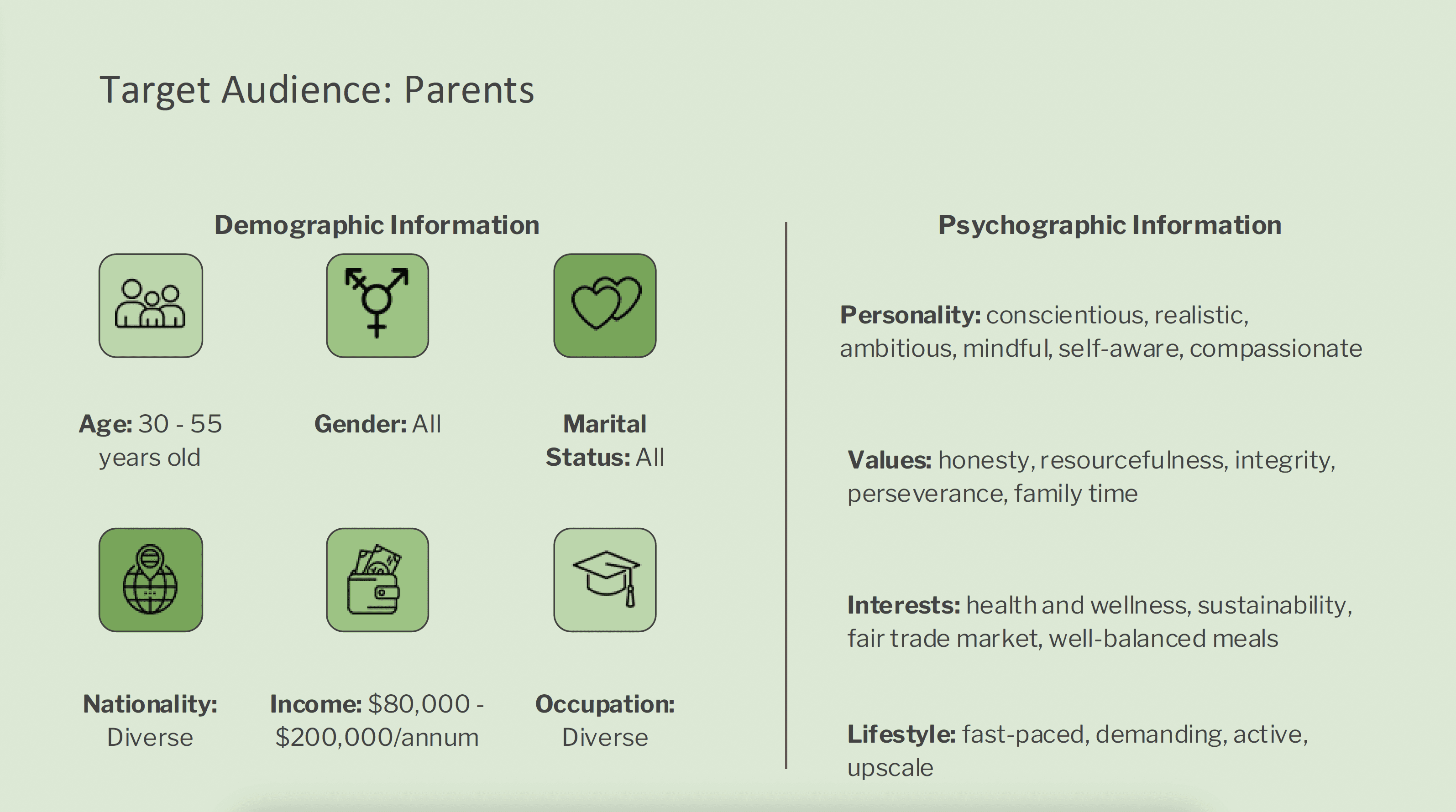
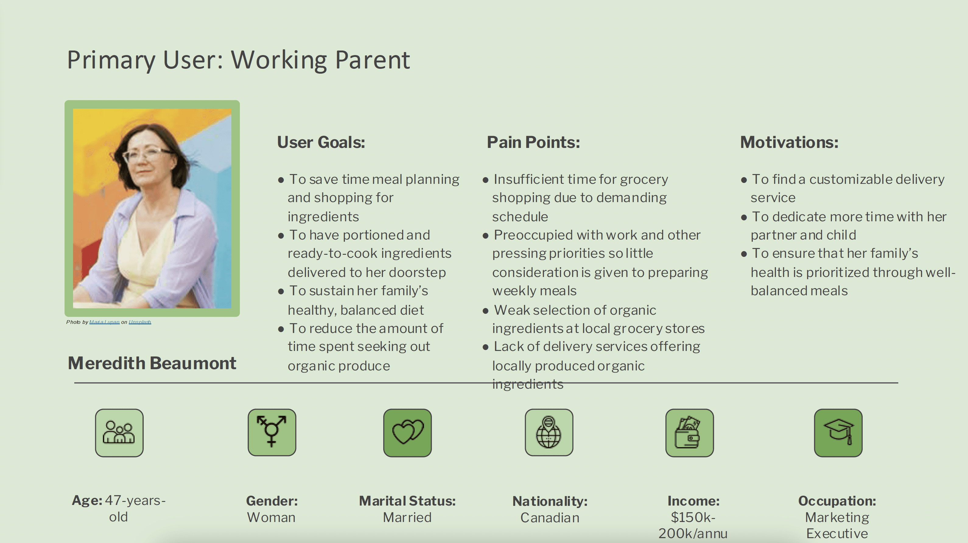
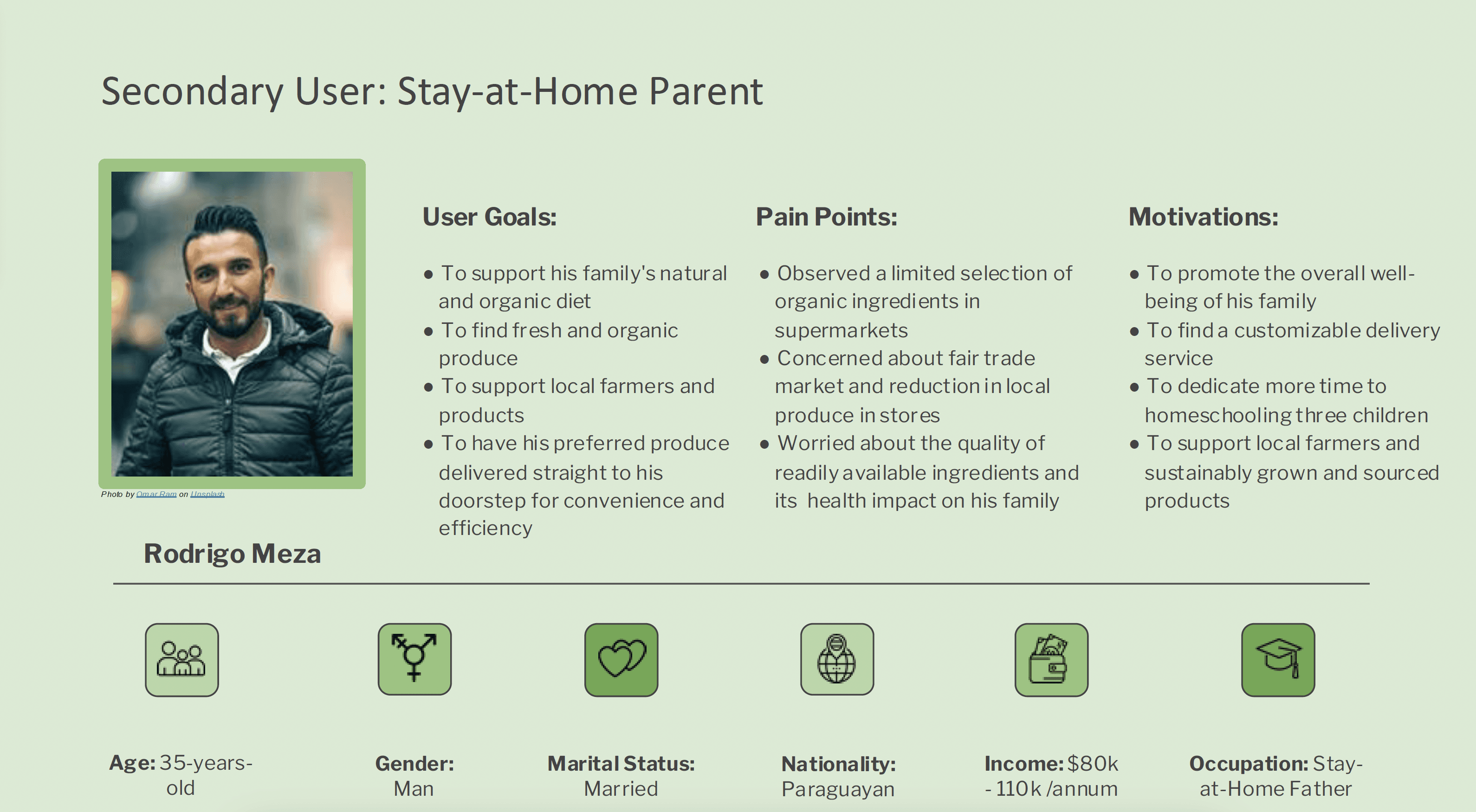
By developing two distinct user personas — working parents (figure 2) and stay-at-home parents (figure 3) — we gain a deeper understanding of their unique needs and preferences.
The Why, How and When
To create a seamless, intuitive experience, we developed user journey maps based on Gaia's Garden's primary personas. These maps visualize each step - from discovering the app and researching options to placing an order and receiving a delivery (figure 4: meal boxes, figure 5: organic produce).
This process helped us uncover key touch points, highlight pain points, and spot opportunities to improve the user experience, ensuring every step feels tailored, efficient, and satisfying.
04
Brand Spirit

Gaia - The Personification of Earth
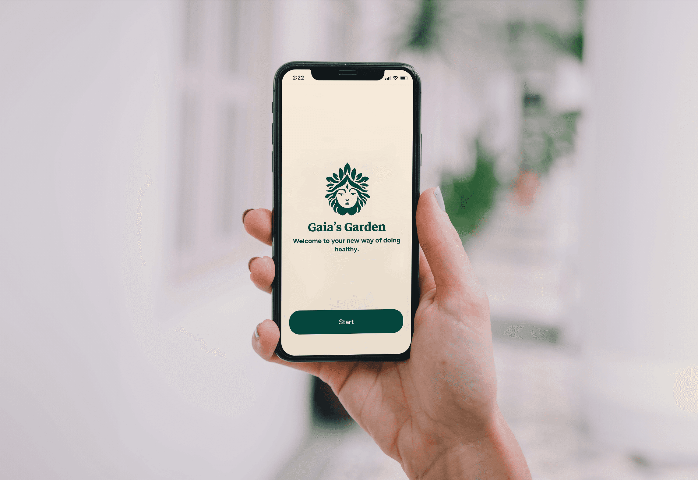
We set out to create a digital garden where Canadians feel proud and connected - connected to their food, their farmers, and their communities.
How? A mobile app that's simple, engaging, and built around local values.
With Gaia's Garden, users can browse and choose local ingredients, curated meal kits, and seasonal packs, while also sharing their own recipes and discoveries. Every interaction adds value to their lives and meaningful support to the farmers who grow their food. users.
Design System
Gaia's Garden is grounded in four core values: sustainability, transparency, friendliness, and warmth.
To bring these to life, we developed a style tile that defines our colour palette, typography, and iconography (figure 8). This cohesive visual language ensures a consistent, inviting experience that reflects our mission whilst fostering a sense of trust, care, and community.
Figure 8 : Style Exploration
Logo Animation
To infuse Gaia's Garden with more personality, we created a playful logo animation featuring Gaia giving a cheeky wink.
This moment adds a touch of sass and reinforces the brand's friendly, down-to-earth tone. The wink acts as Gaia's stamp of approval - a fun, reassuring cue that users are making choices that support their health, the environment, and their local community.
It's a small detail that builds a stronger emotional connection while reinforcing the brand's values.

05
Design Process
To ensure a seamless experience, we designed two user flows based on Gaia's Garden's primary personas.
Each flow outlines the key steps - from launching the app to completing an order - highlighting how different users navigate the platform to meet their needs efficiently.
1. Subscribing to a meal kit (figure 9): This flow focuses on users subscribing to a weekly meal kit.
2. Subscribing to a produce box (figure 10): This flow focuses users subscribing to a produce box.

Low-Fidelity Wireframes
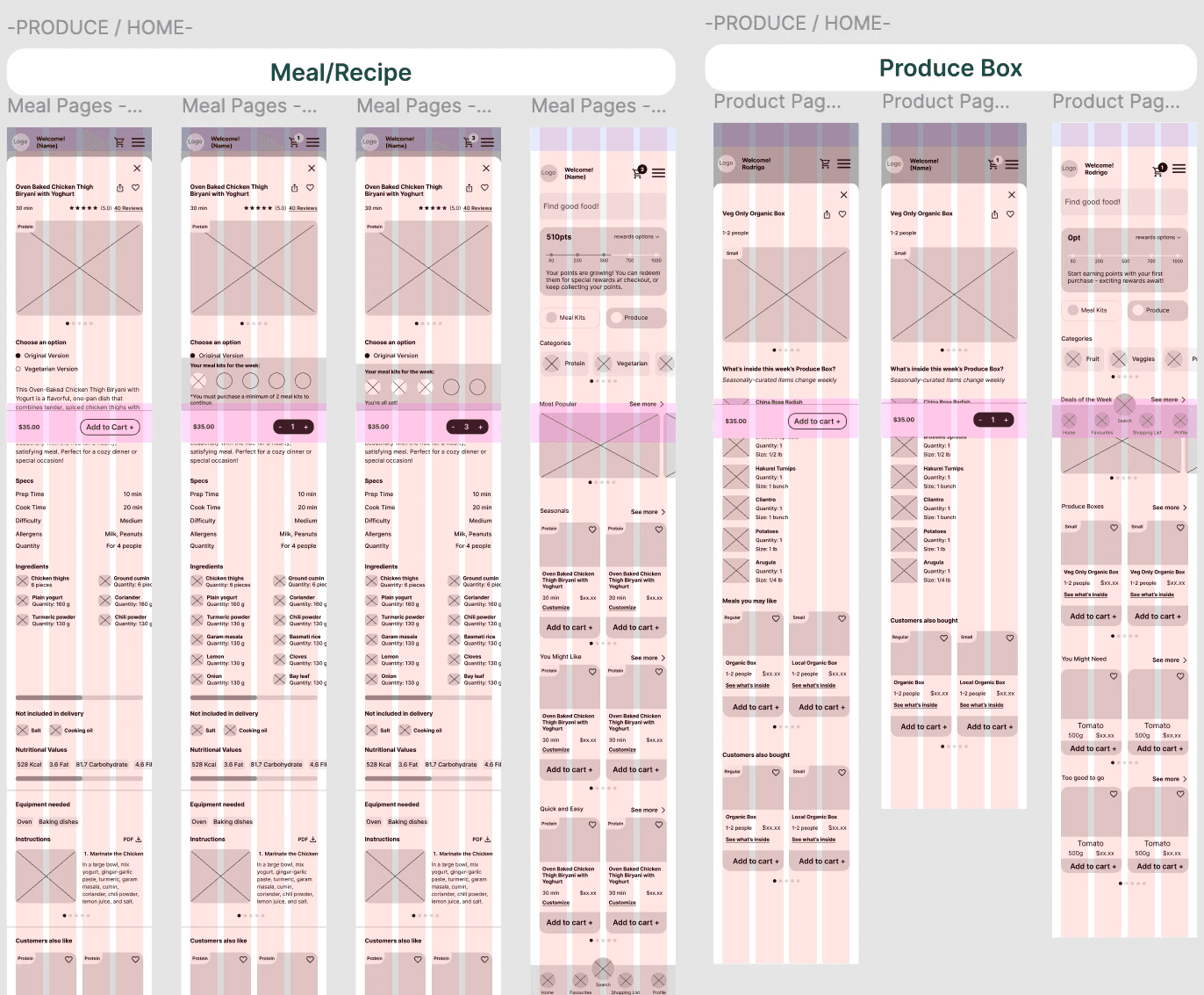
Figure 11 : View our low fidelity wireframes
06
Usability
100%
participants found the meal selection process to be confusing and overwhelming
100%
participants found some text needed more clarity, such as the difference between meal kits and meal boxes
67%
participants found some icons to be confusing
07
Final Design
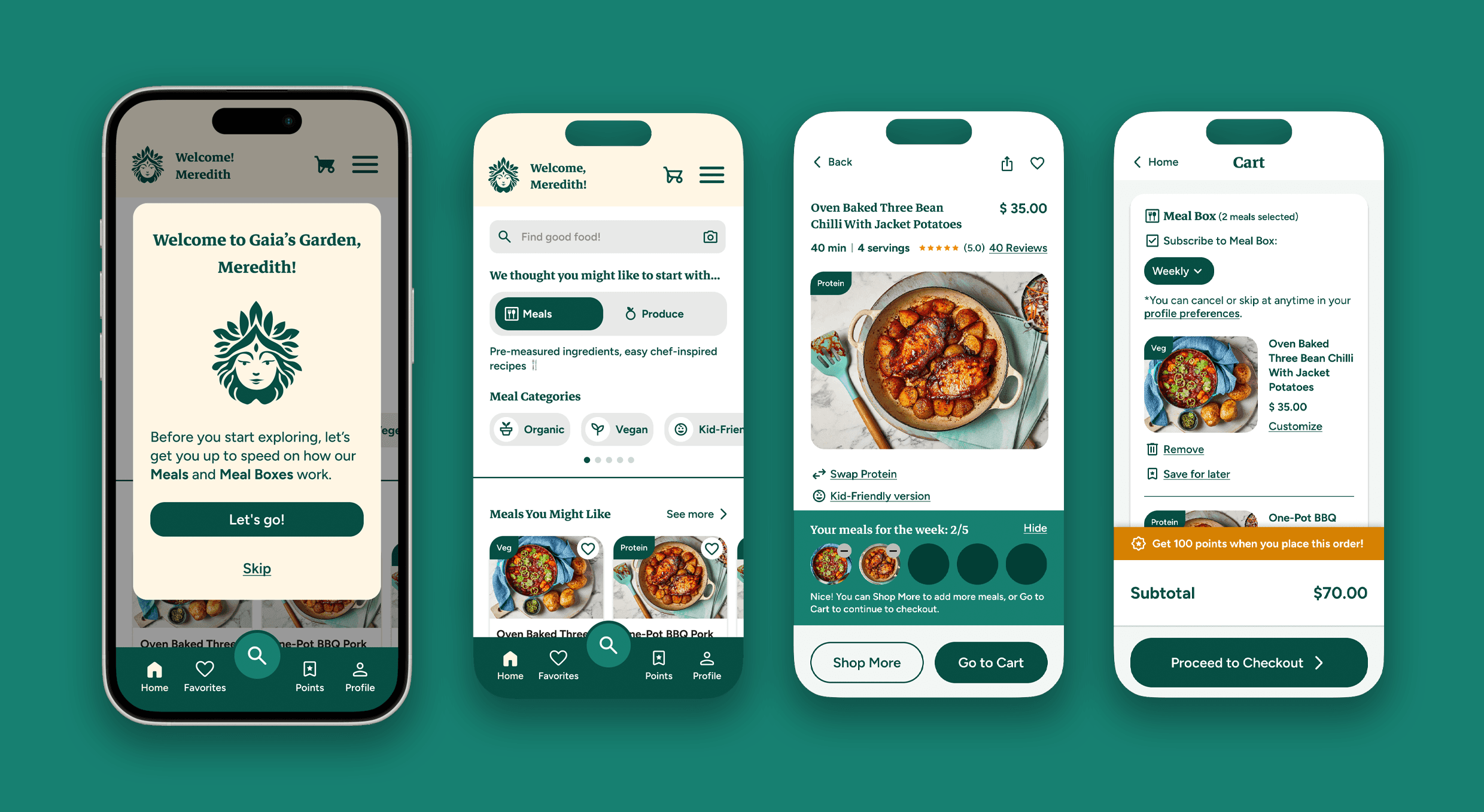
Signing up & subscribing to a Meal Box
Logging in & subscribing to a Produce Box