Places4Students' Platform Redesign
Places4Students' Platform Redesign
Places4Students' Platform Redesign
Places4Students' Platform Redesign
ROLE
ROLE
UX designer, UI designer, UX researcher
UX designer, UI designer, UX researcher
TOOLS
TOOLS
Figma, Adobe Illustration, Adobe After Effects
Figma, Adobe Illustration, Adobe After Effects
TEAM
TEAM
Sarika Bhageratty, Rosa Moriya
Sarika Bhageratty, Rosa Moriya
DESIGN TOUCH POINTS
DESIGN TOUCH POINTS
UX analysis of Places4Students' existing website to identify key usability issues. Redesigned the platform to improve clarity, trust, and navigation.
Places4Students is a platform that aims to connect students with rental housing.
UX analysis of Places4Students' existing website to identify key usability issues. Redesigned the platform to improve clarity, trust, and navigation.
Places4Students is a platform that aims to connect students with rental housing.
THE PROBLEM
THE PROBLEM
THE PROBLEM
Places4Students' current platform presents several usability challenges.
Places4Students' current platform presents several usability challenges.
What are the challenges?
What are the challenges?
Users struggle with a cluttered interface, unclear listing details, and a noticeable lack of trust indicators. The outdated design falls short of modern expectations and fails to deliver a seamless, mobile-friendly experience.
Users struggle with a cluttered interface, unclear listing details, and a noticeable lack of trust indicators. The outdated design falls short of modern expectations and fails to deliver a seamless, mobile-friendly experience.

THE USER
THE USER
THE USER
Our primary audience was international students searching for off-campus housing. Their key concerns centred around ease of search, credibility of listings, and a stress-free decision-making process.
Our primary audience was international students searching for off-campus housing. Their key concerns centred around ease of search, credibility of listings, and a stress-free decision-making process.
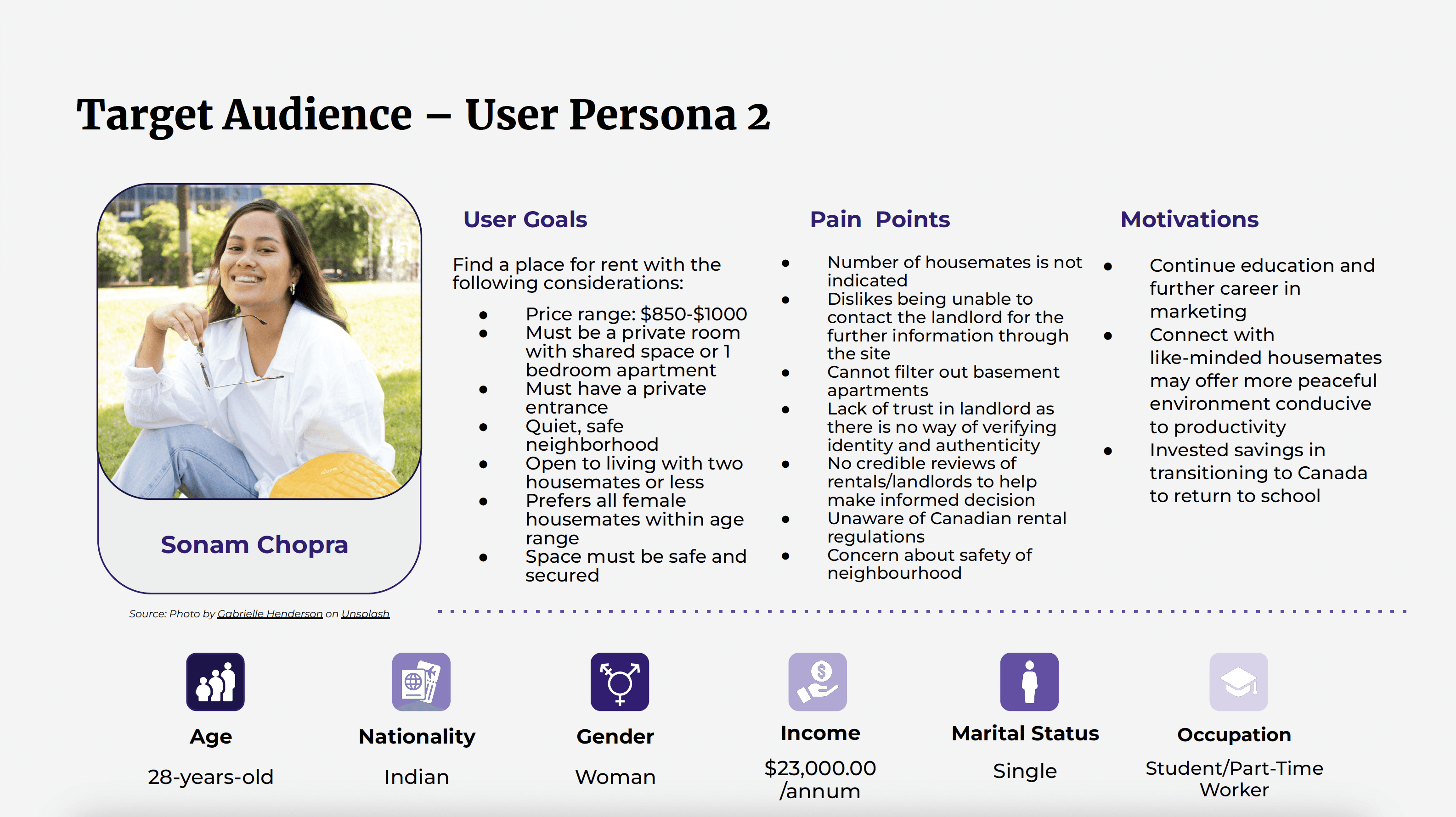
By understanding our users' unique goals, frustrations, and behaviours, we were able to design a more intuitive and user-centred experience tailored to their needs.
By understanding our users' unique goals, frustrations, and behaviours, we were able to design a more intuitive and user-centred experience tailored to their needs.
Empathy Mapping
Empathy Mapping
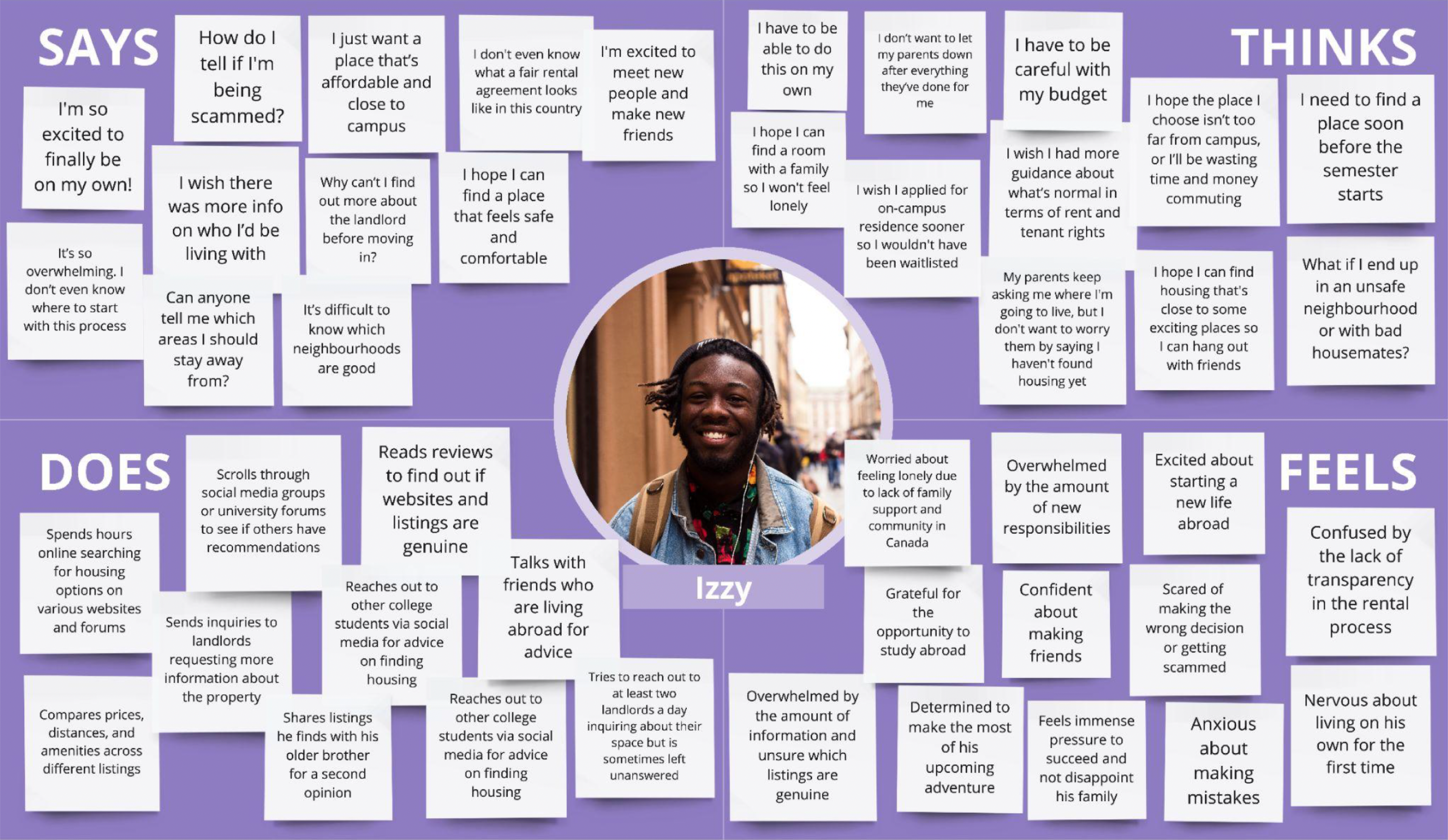
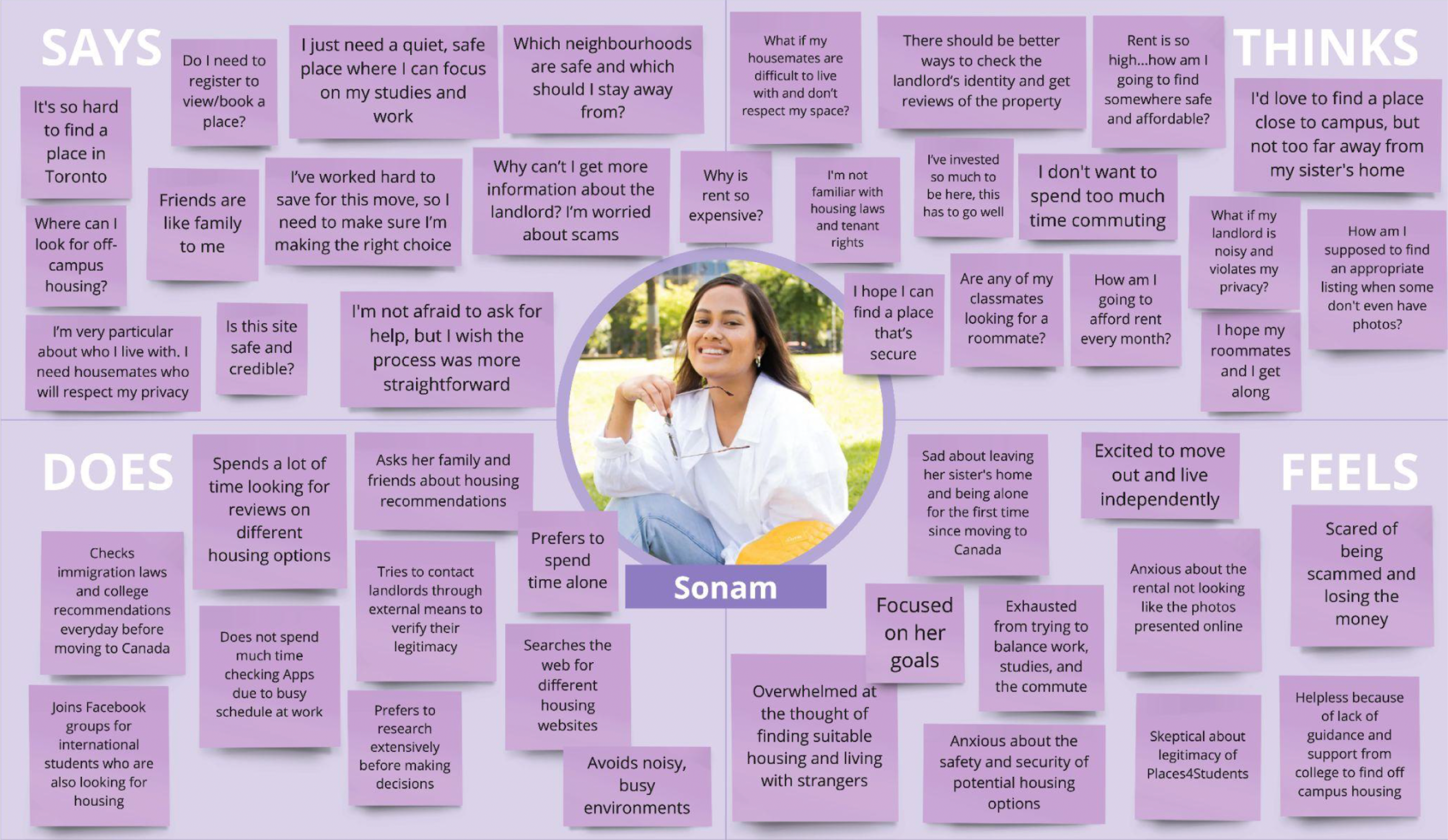
To deepen our understanding of user needs, frustrations, and motivations, we developed empathy maps for both primary user groups.
For students seeking roommates, the emphasis was on trust and compatibility. Their main concerns included finding someone with similar living habits, avoiding unreliable matches, and ensuring a safe, respectful, and comfortable living environment.
For students searching for off-campus housing, key concerns included unclear listings, security, and affordability. Their priority is a stress-free, trustworthy platform that offers verified information and a straightforward process, empowering them to make confident housing decisions.
DESIGN PROCESS
DESIGN PROCESS
DESIGN PROCESS
Heuristic Evaluation
Heuristic Evaluation
We conducted a heuristic evaluation using Nielsen Norman's 10 usability heuristics to identify usability issues. Each heuristic was classified and tagged to pinpoint specific problem areas within the website (figure 8), which helped guide our redesign strategy.
We conducted a heuristic evaluation using Nielsen Norman's 10 usability heuristics to identify usability issues. Each heuristic was classified and tagged to pinpoint specific problem areas within the website (figure 8), which helped guide our redesign strategy.

Visual Design & Brand Identity
Visual Design & Brand Identity
Research revealed a strong preference for clean, minimalist aesthetics among our target audience. This insight informed our design direction, guiding the adoption of a modern, intuitive visual style.
Research revealed a strong preference for clean, minimalist aesthetics among our target audience. This insight informed our design direction, guiding the adoption of a modern, intuitive visual style.
Colour Palette
Colour Palette
To stand out from platforms like Facebook Marketplace and Zillow, while also conveying safety, warmth, and modernity, we carefully selected a distinctive colour scheme:
• Primary Colour: Instead of the conventional “trust blue,” we chose a bold yet sophisticated purple to signal both credibility and freshness.
• Secondary Colour: A warm, inviting yellow complements the purple, evoking a sense of coziness, friendliness, and familiarity for student users.

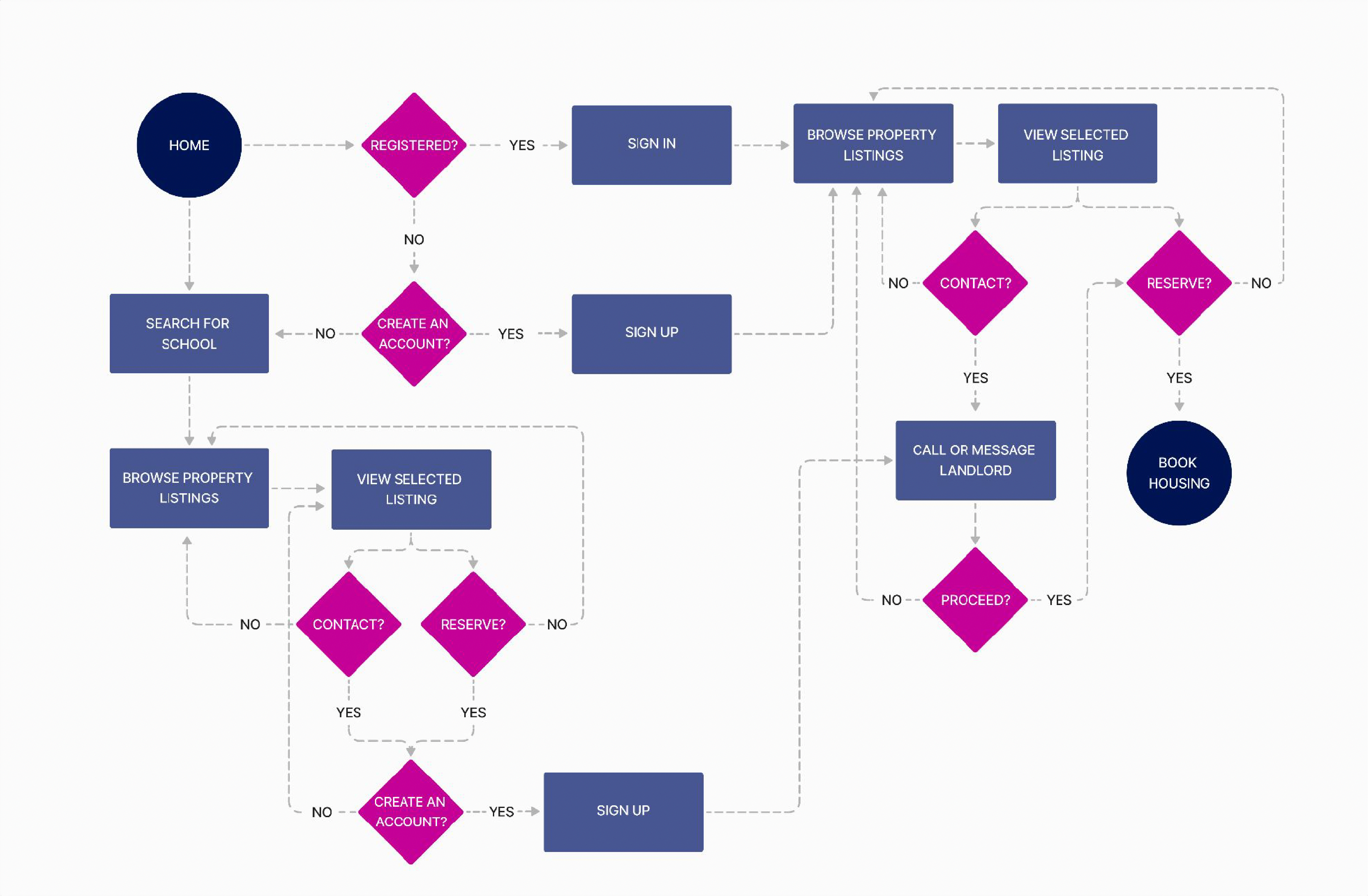
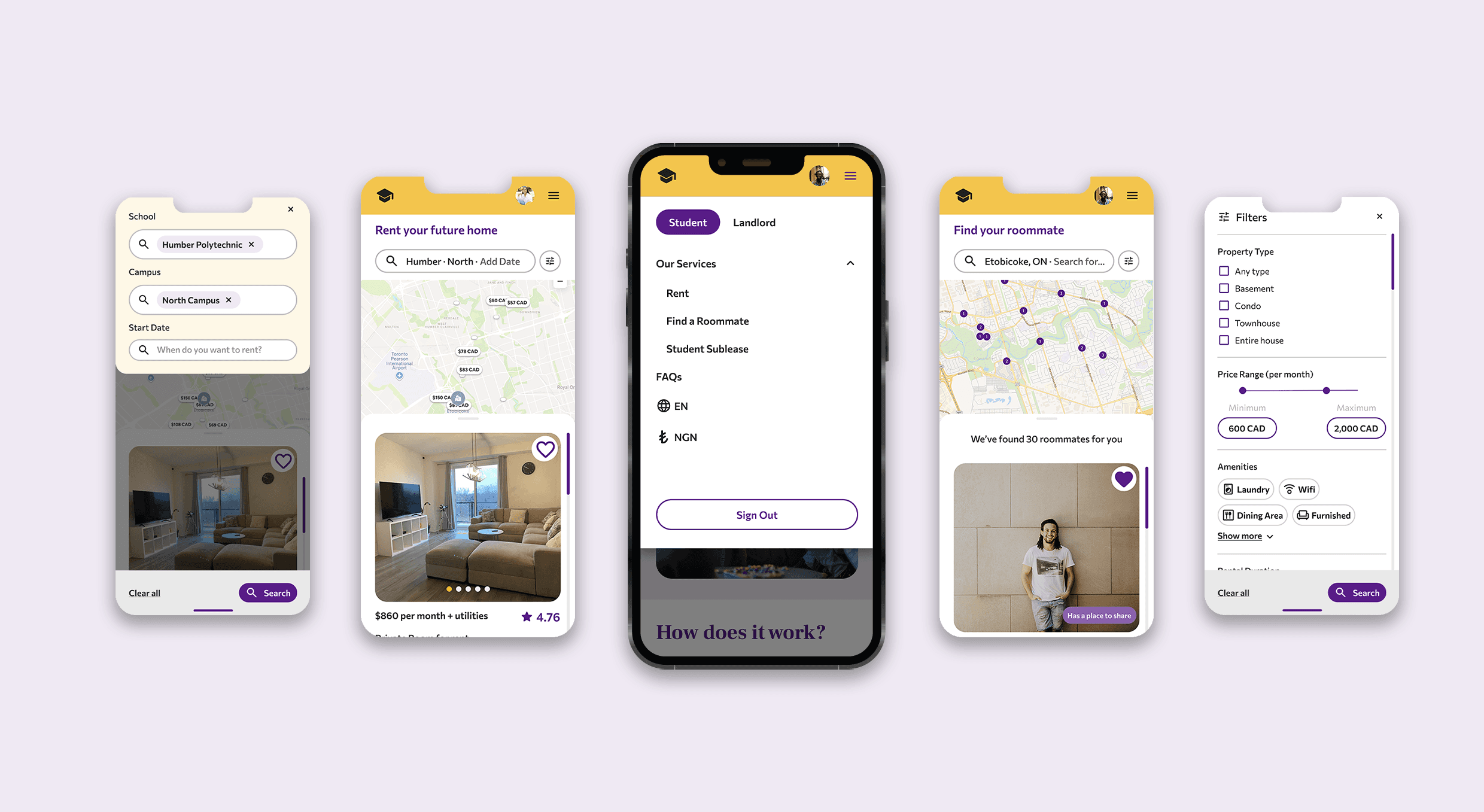
Defining the User Flow and Low-Fidelity wireframes
Defining the User Flow and Low-Fidelity wireframes
We designed two distinct user flows to address the platform's core use cases:
• Students searching for a compatible roommate;
• Students looking for off-campus housing
By tailoring the experience to these specific goals, we created a more intuitive and efficient navigation process for each user type.

USABILITY
USABILITY
USABILITY
During the usability testing, we gathered feedback from four participants, analyzing their responses in relation to the four key issues identified during our heuristic evaluation of the original Places4Students website.
During the usability testing, we gathered feedback from four participants, analyzing their responses in relation to the four key issues identified during our heuristic evaluation of the original Places4Students website.
50%
50%
50%
participants were confused with certain terms used throughout the website.
participants were confused with certain terms used throughout the website.
75%
75%
75%
participants were initially confused about where to find the roommate feature and suggested double-parking the link.
participants were initially confused about where to find the roommate feature and suggested double-parking the link.
FINAL DESIGN
FINAL DESIGN
FINAL DESIGN
Guided by peer feedback, we completed multiple rounds of iteration to resolve key usability issues. These refinements enhanced the user experience, clarified visual hierarchy, and ensured the final design was both functional and aligned with the brand identity - resulting in a seamless, engaging experience.
Guided by peer feedback, we completed multiple rounds of iteration to resolve key usability issues. These refinements enhanced the user experience, clarified visual hierarchy, and ensured the final design was both functional and aligned with the brand identity - resulting in a seamless, engaging experience.
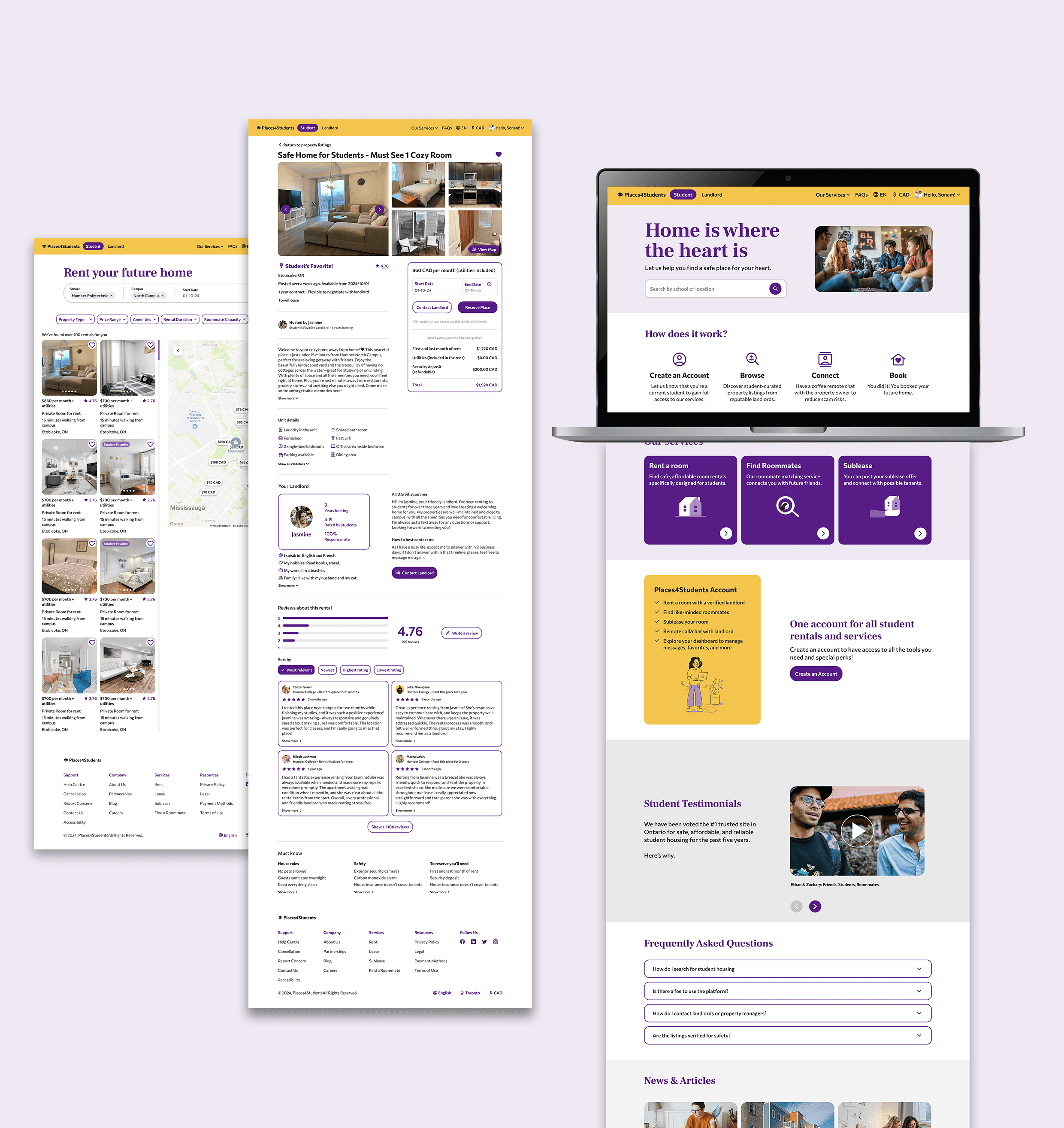
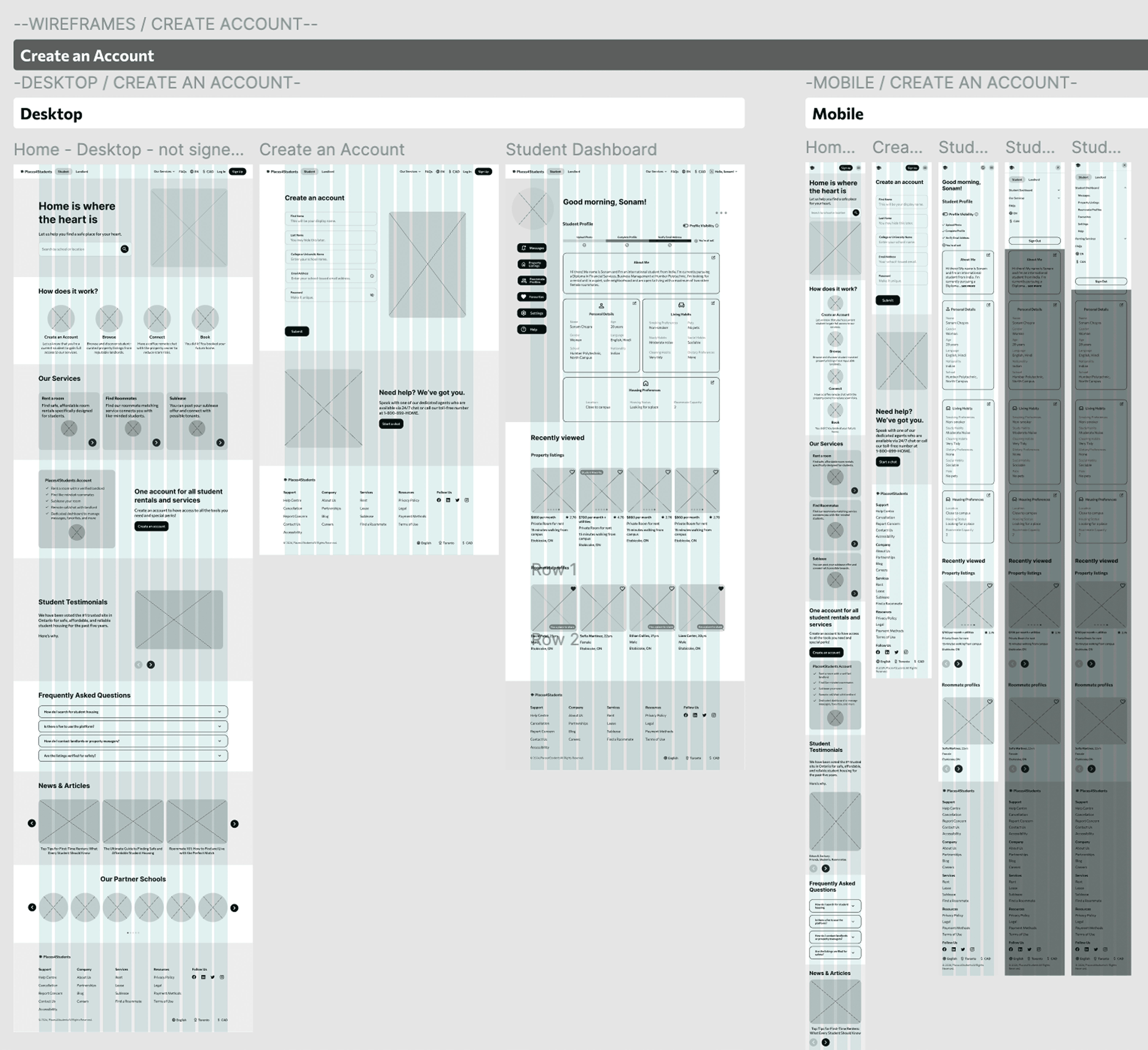
Creating an account & renting a room
Contacting a potential a roommate
Creating an account & renting a room
Contacting a potential a roommate
© 2026 All rights reserved
© 2026 All rights reserved