Places4Students
" height="9.976935876965042px" id="jM9KX23vu" transform="translate(27 12.5)" width="17.009821060712284px"/><path d="M 5.838 0.565 C 3.428 2.794 1.456 5.456 0.025 8.411 C -0.168 8.805 0.805 8.7 0.942 8.676 C 1.337 8.603 2.066 8.449 2.268 8.026 C 3.652 5.161 5.564 2.582 7.902 0.425 C 8.292 0.065 7.564 -0.013 7.357 0.002 C 6.844 0.031 6.227 0.199 5.837 0.56 L 5.837 0.565 Z" fill="rgb(64, 89, 49)" height="8.70636676391473px" id="UuxbLLJgG" transform="translate(35.5 14)" width="8.015254571864489px"/><path d="M 60.591 7.991 C 47.922 0.962 24.641 -3.495 5.188 3.564 L 5.028 3.636 C 4.882 3.711 4.759 3.826 4.674 3.967 C 4.557 4.161 4.562 4.404 4.687 4.593 C 4.814 4.786 5.033 4.887 5.246 4.925 C 5.464 4.963 5.713 4.943 5.948 4.861 L 5.951 4.861 C 24.991 -2.05 47.831 2.566 59.894 9.52 C 62.654 11.114 66.18 13.69 68.248 16.725 C 69.26 18.202 69.911 19.774 69.948 21.382 C 69.984 22.983 69.412 24.651 67.923 26.329 C 64.7 29.962 59.77 31.249 56.073 32.446 L 56.072 32.446 C 47.83 35.124 38.02 35.67 28.92 34.502 C 19.815 33.333 11.455 30.452 6.1 26.31 C 2.677 23.654 1.51 20.696 2.153 17.77 C 2.801 14.816 5.306 11.817 9.401 9.142 C 11.751 7.608 14.091 6.212 17.108 5.556 L 17.721 5.436 C 17.95 5.394 18.163 5.29 18.313 5.145 C 18.456 5.006 18.567 4.799 18.518 4.565 C 18.483 4.315 18.288 4.157 18.094 4.078 C 17.876 3.995 17.64 3.975 17.411 4.018 C 13.701 4.68 10.883 6.302 8.176 8.082 L 8.177 8.082 C 3.725 10.989 0.913 14.311 0.187 17.679 C -0.545 21.074 0.857 24.439 4.65 27.378 C 10.27 31.734 19.005 34.723 28.462 35.931 C 37.924 37.138 48.14 36.568 56.734 33.774 C 60.604 32.518 66.002 31.061 69.537 27.063 L 69.538 27.062 C 70.885 25.531 71.602 23.979 71.821 22.446 C 72.041 20.913 71.761 19.416 71.147 17.996 L 71.147 17.994 C 70.244 15.921 68.613 14.005 66.787 12.362 C 64.96 10.717 62.922 9.332 61.187 8.327 Z" fill="rgb(64, 89, 49)" height="36.52947865113197px" id="C8JbtENhC" stroke-dasharray="" stroke-linecap="butt" stroke-linejoin="miter" stroke-miterlimit="10" stroke-width="0.5" stroke="rgb(64, 89, 49)" width="71.89551202796224px"/></g></svg>)
COLLABORATORS
Sarika Bhageratty
Rosa Moriya
TOOLS
Figma
Adobe Illustrator
DURATION
7 weeks
01
The Problem
Places4Students aims to connect students with rental housing, but its current platform presents several usability challenges.
Students struggle with a cluttered interface, unclear listing details, and a noticeable lack of trust indicators. The outdated design (figure 1) falls short of modern expectations and fails to deliver a seamless, mobile-friendly experience.
For both local and international students, already juggling academics, part-time work, and independent living, the housing search should be simple and stress-free, not an additional source of frustration.
02
The User
By understanding our users' unique goals, frustrations, and behaviours, we were able to design a more intuitive and user-centred experience tailored to their needs.
Empathy Mapping
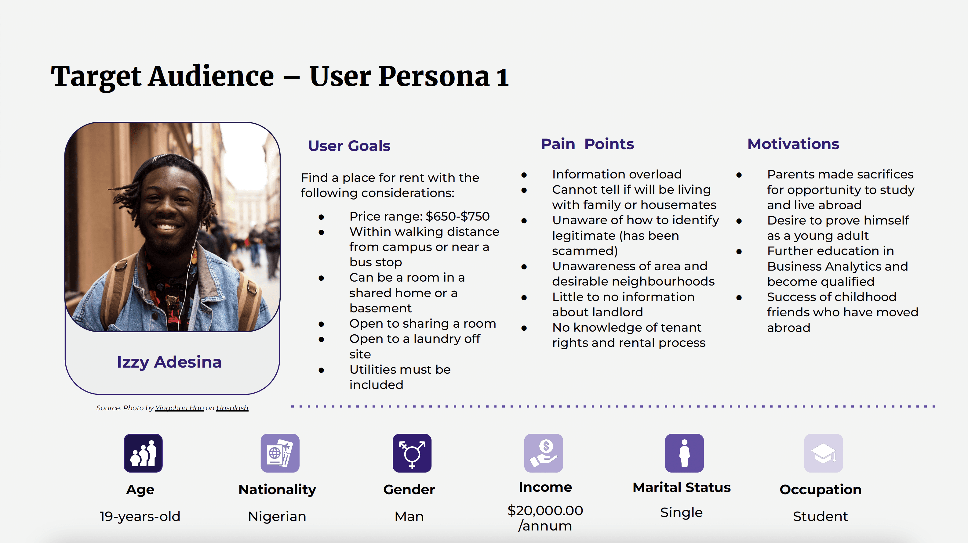
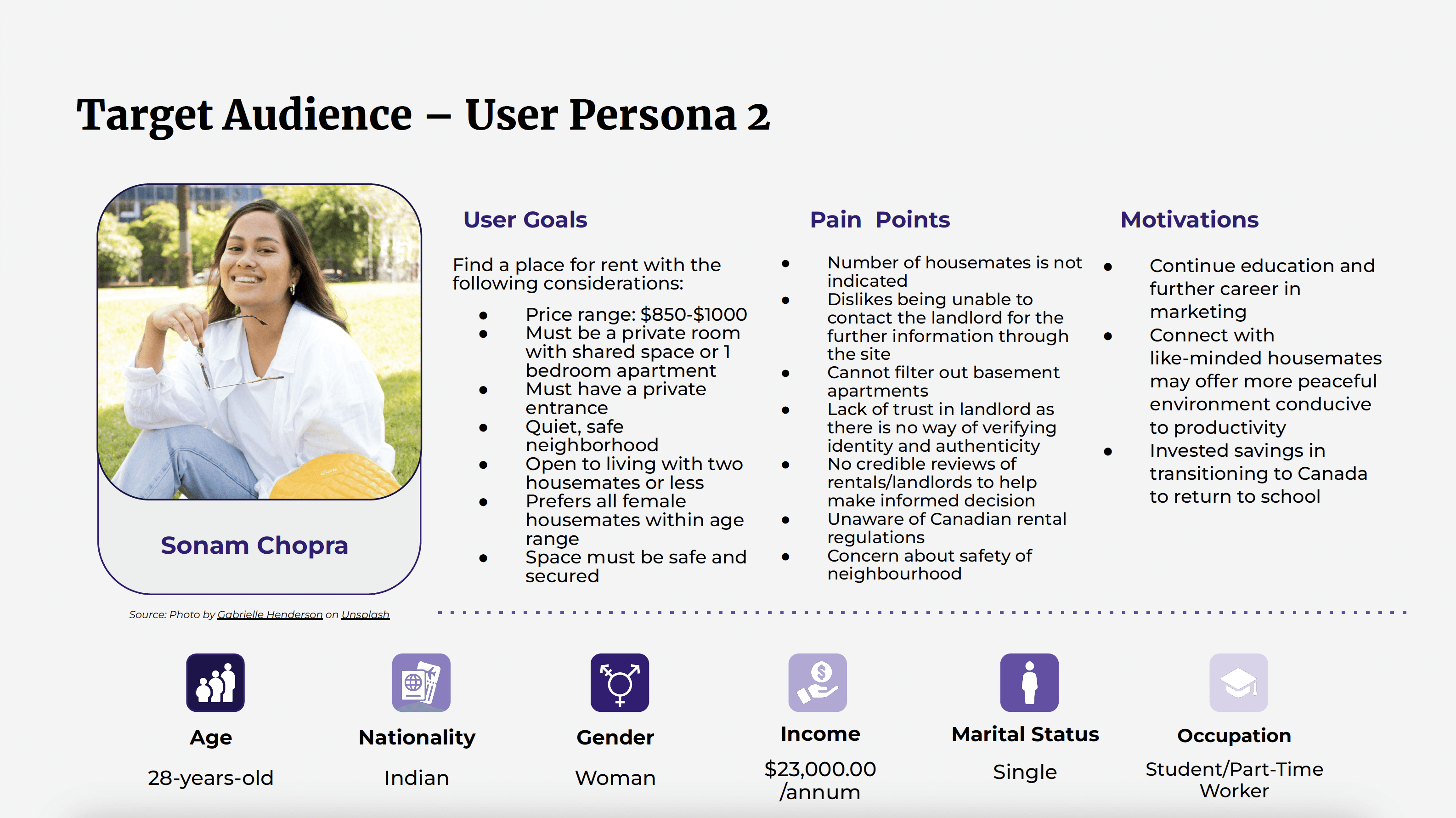
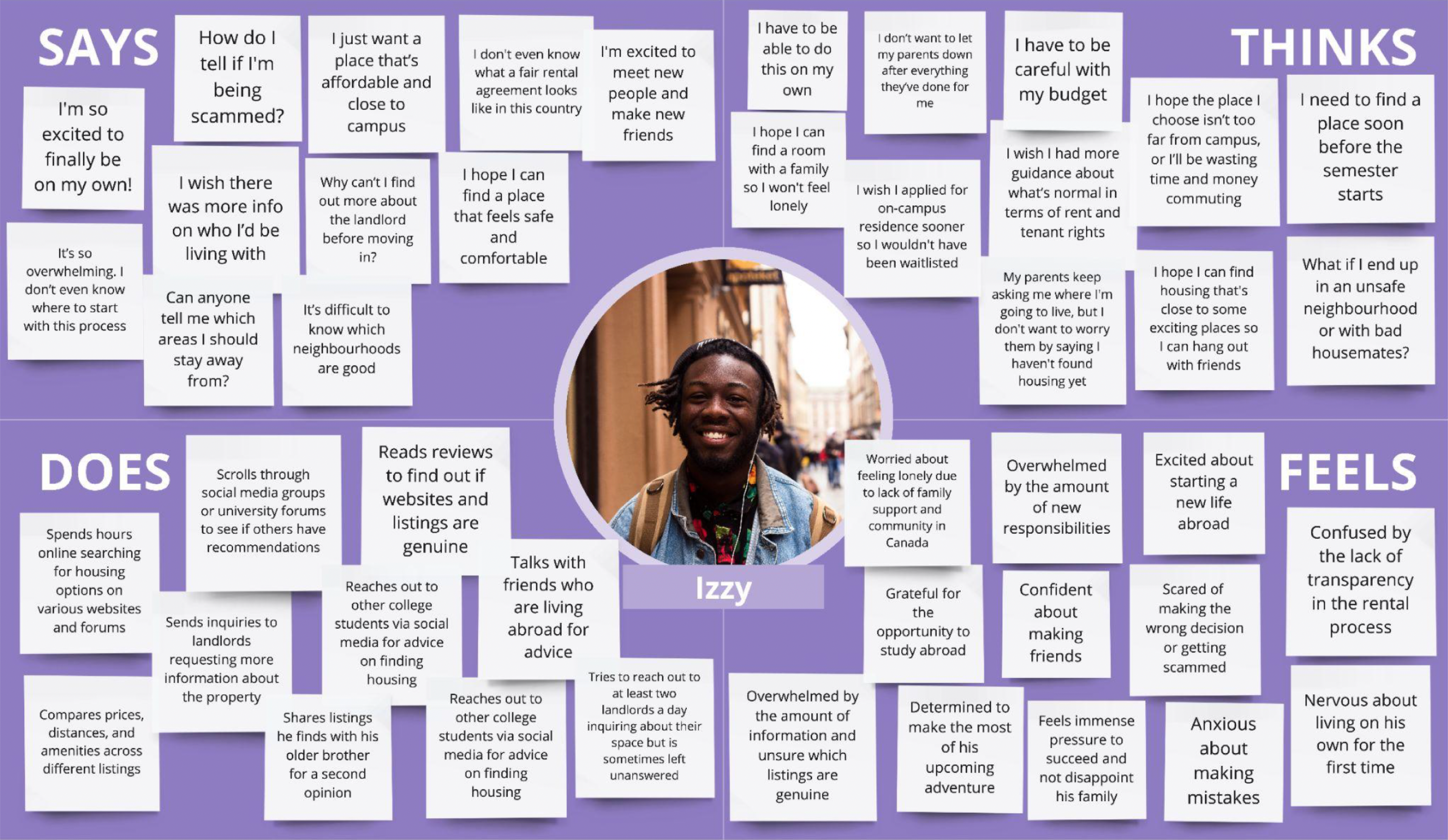
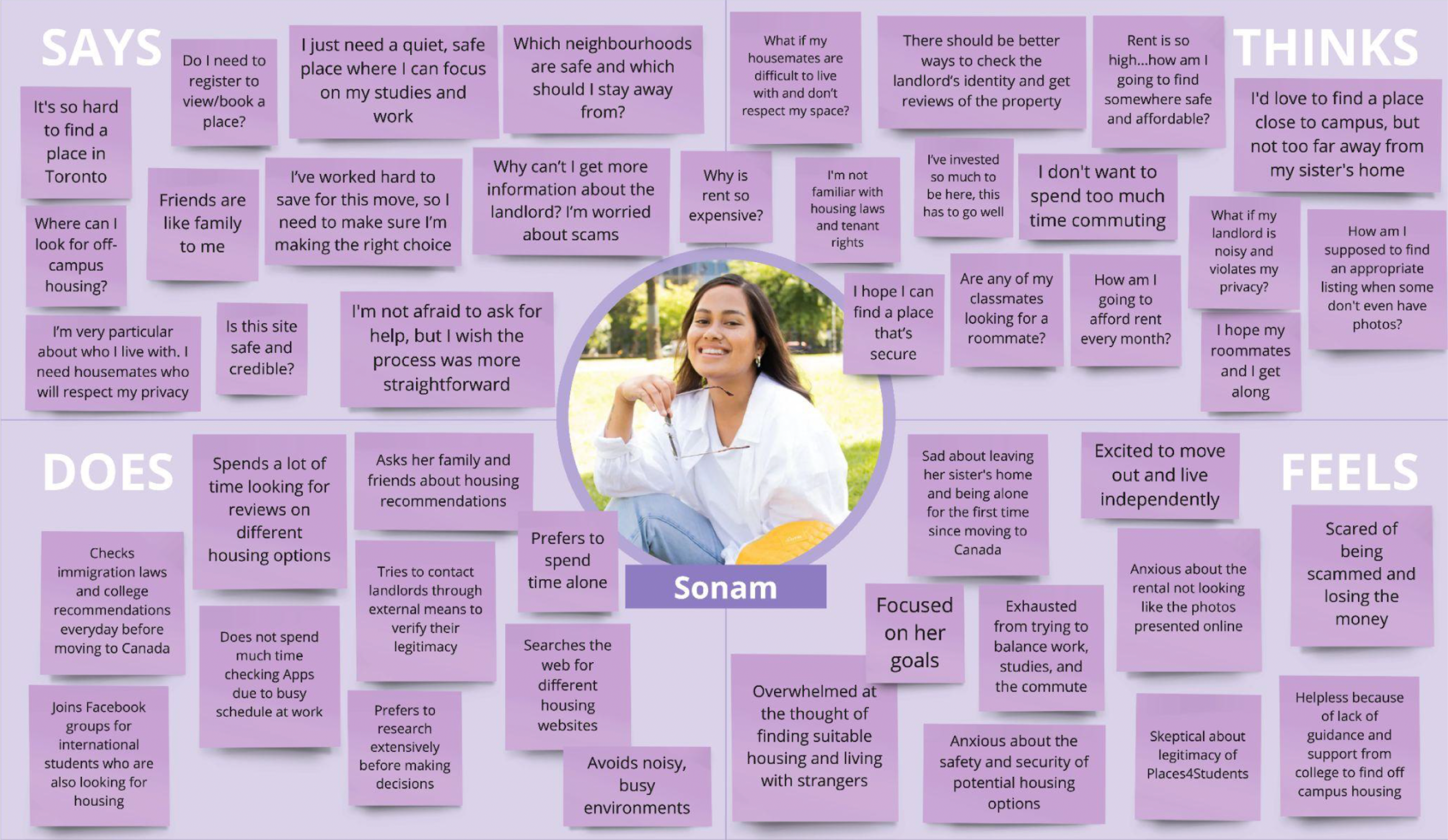
To deepen our understanding of user needs, frustrations, and motivations, we developed empathy maps for both primary user groups.
For students seeking roommates, the emphasis was on trust and compatibility. Their main concerns included finding someone with similar living habits, avoiding unreliable matches, and ensuring a safe, respectful, and comfortable living environment (figure 6).
For students searching for off-campus housing, key concerns included unclear listings, security, and affordability. Their priority is a stress-free, trustworthy platform that offers verified information and a straightforward process, empowering them to make confident housing decisions (figure 7).
03
Design Process
We conducted a heuristic evaluation using Nielsen Norman's 10 usability heuristics to identify usability issues. Each heuristic was classified and tagged to pinpoint specific problem areas within the website (figure 8), which helped guide our redesign strategy.
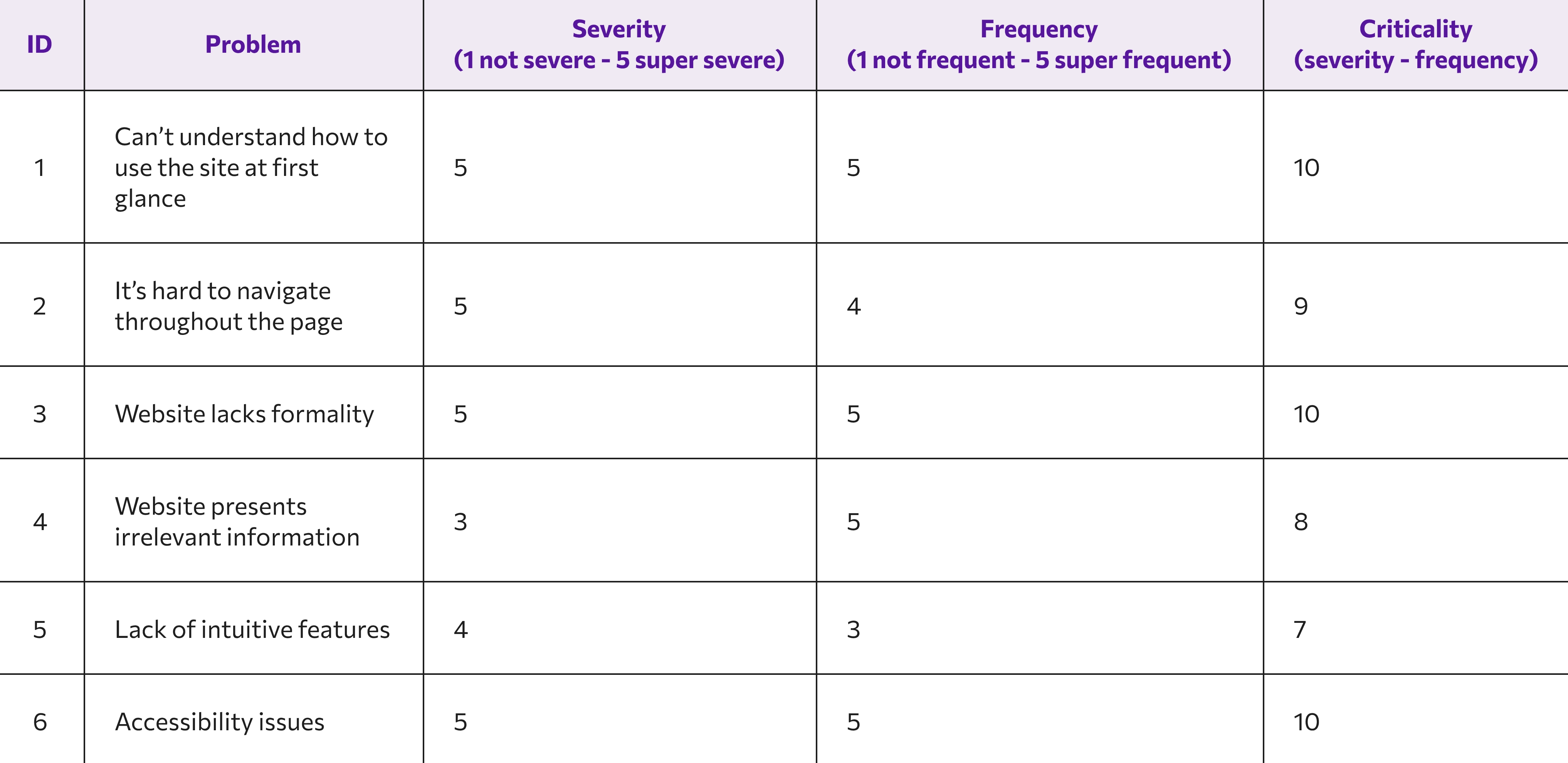
Figure 8 : Read our full Heuristic Evaluation report
Visual Design & Brand Identity
Research revealed a strong preference for clean, minimalist aesthetics among our target audience. This insight informed our design direction (Figure 9), guiding the adoption of a modern, intuitive visual style.

Figure 9 : Style Tile
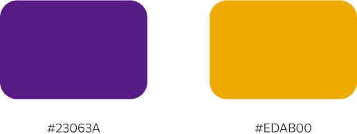
Colour Palette
To stand out from platforms like Facebook Marketplace and Zillow, while also conveying safety, warmth, and modernity, we carefully selected a distinctive colour scheme:
• Primary Colour: Instead of the conventional “trust blue,” we chose a bold yet sophisticated purple to signal both credibility and freshness.
• Secondary Colour: A warm, inviting yellow complements the purple, evoking a sense of coziness, friendliness, and familiarity for student users.
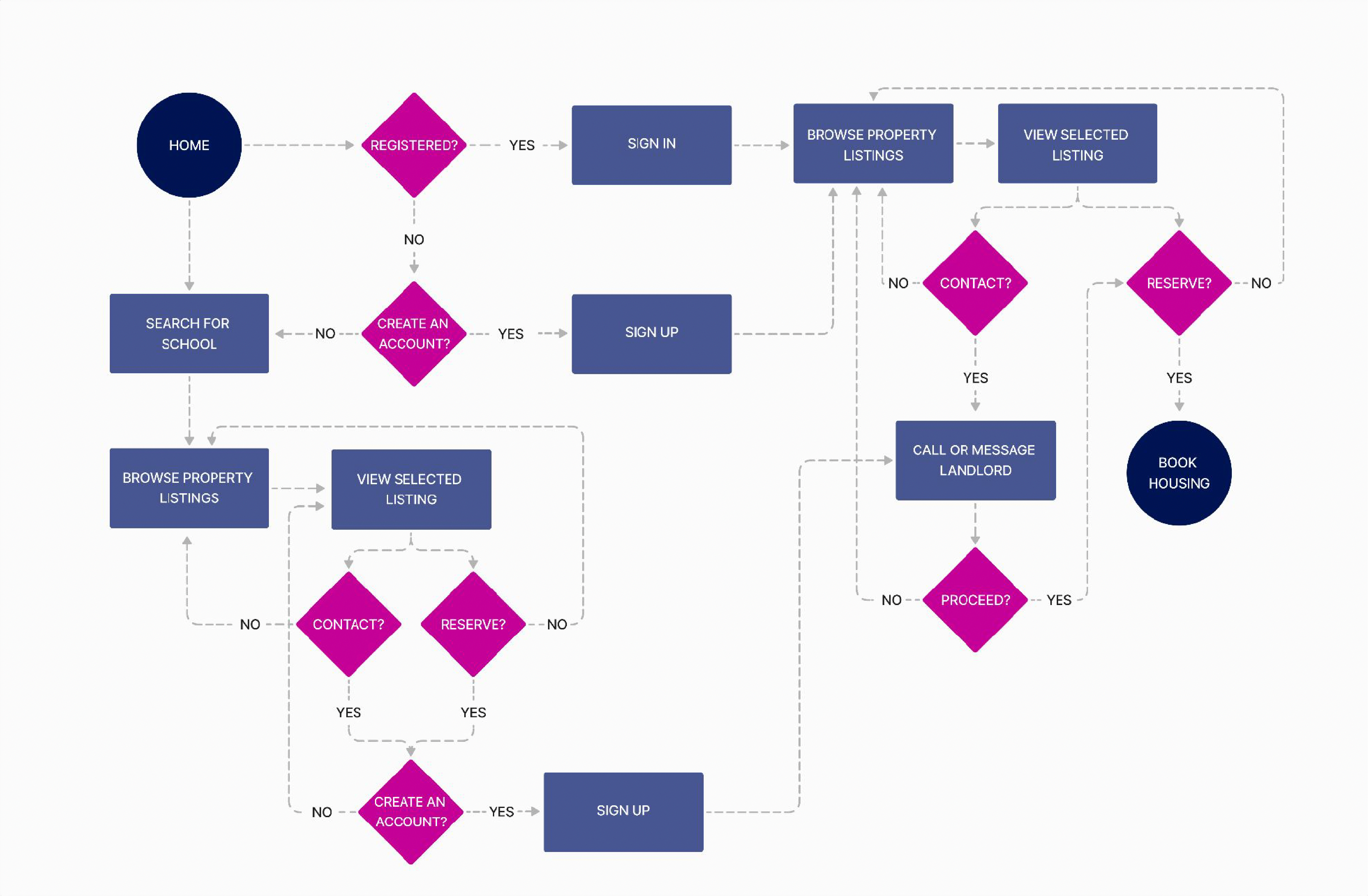
Defining the User Flow
We designed two distinct user flows to address the platform's core use cases:
• Students searching for a compatible roommate (figure 10)
• Students looking for off-campus housing (figure 11)
By tailoring the experience to these specific goals, we created a more intuitive and efficient navigation process for each user type.

Low-Fidelity Wireframes
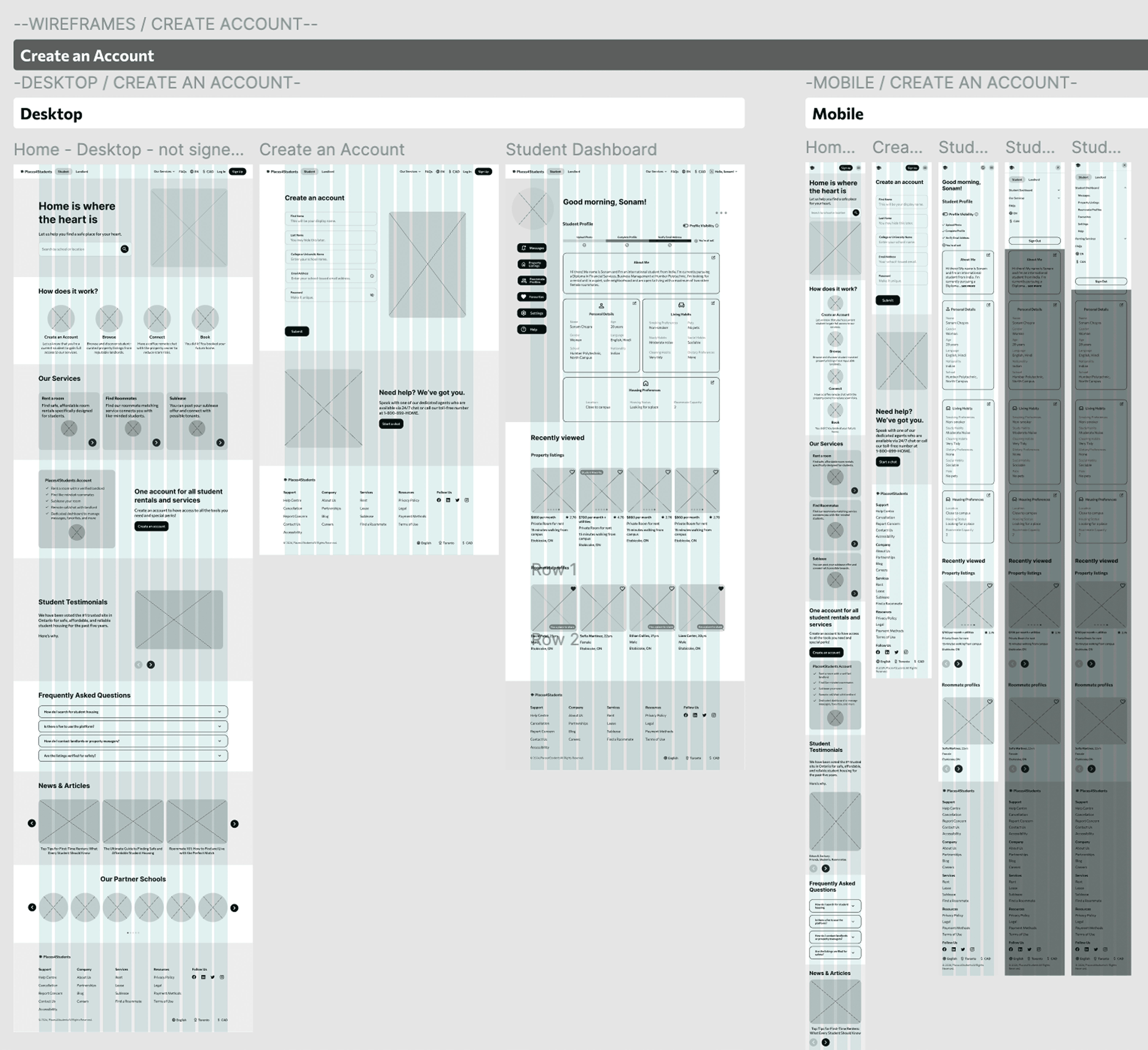
Figure 12 : Low-fidelity wireframes
04
Usability
50%
participants were confused with certain terms used throughout the website.
75%
participants were initially confused about where to find the roommate feature and suggested double-parking the link.
05
Final Design
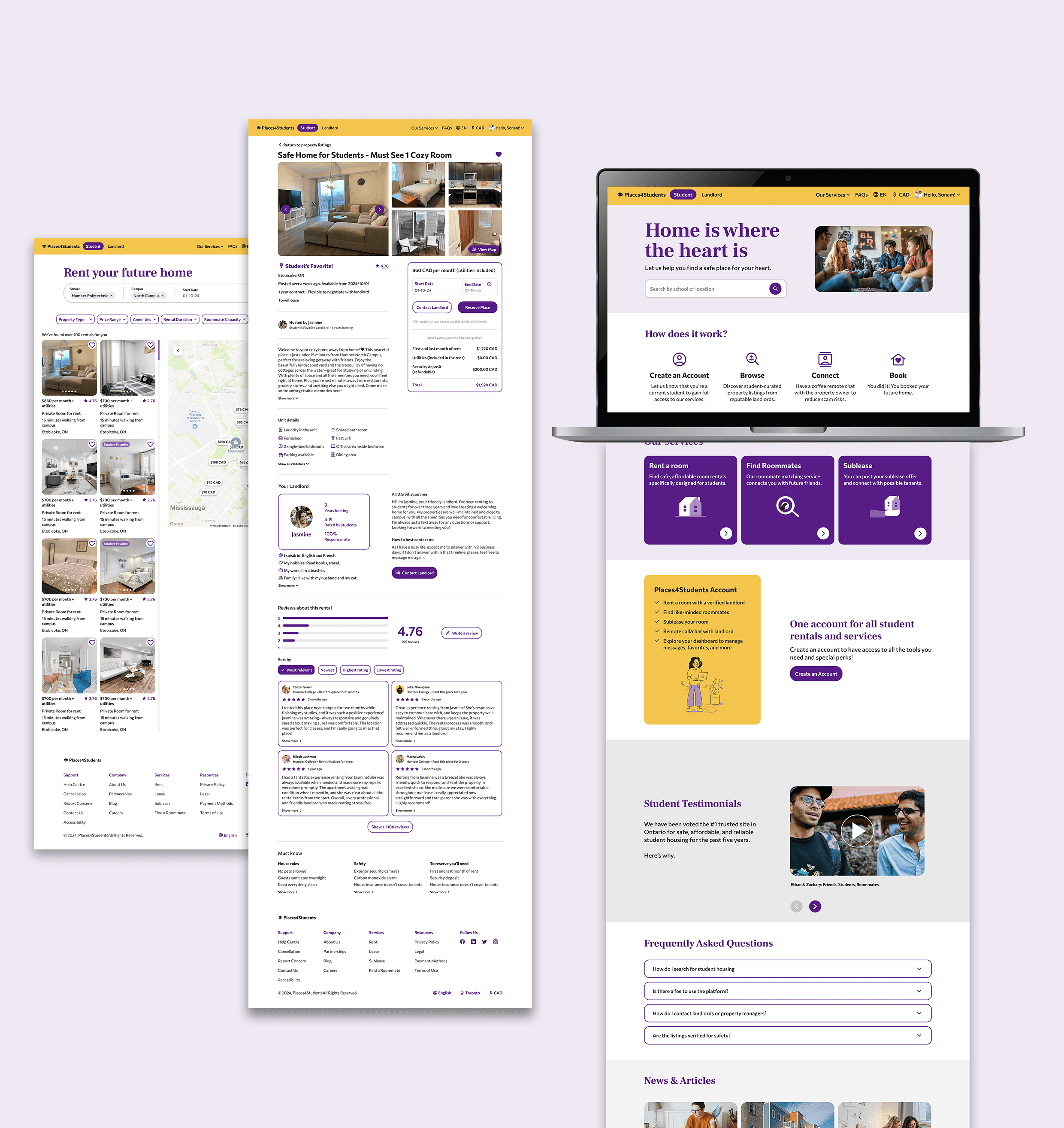
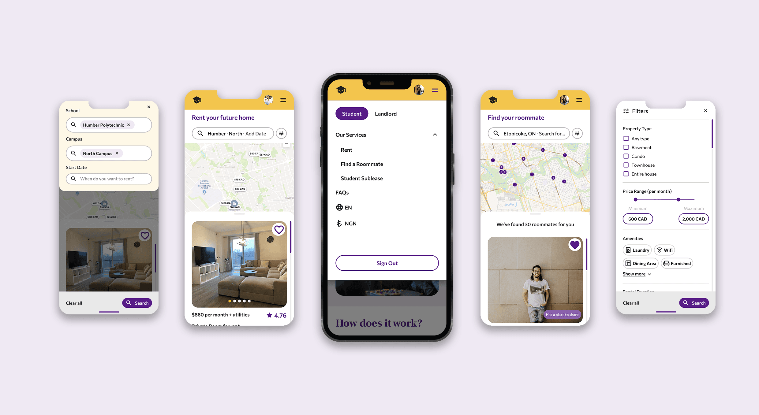
Creating an account & renting a room
Contacting a potential a roommate
Creating an account & renting a room
Contacting a potential a roommate