Visual Typography
Visual Typography
" height="36.371463615377934px" id="fzbpDZF7r" stroke-dasharray="" stroke-linecap="butt" stroke-linejoin="miter" stroke-miterlimit="10" stroke-width="0.25" stroke="rgb(64, 89, 49)" width="117.97083802933662px"/><path d="M 8.759 2.589 C 5.773 0.426 0.195 1.505 0.004 5.748 C -0.08 7.643 1.053 9.478 2.942 9.962 C 5.153 10.528 7.048 9.515 8.324 7.732 C 9.715 5.791 10.27 3.375 9.867 1.022 L 7.638 0.879 L 9.319 8.65 C 9.879 11.243 10.577 13.77 10.887 16.362 C 11.149 18.538 10.952 20.939 9.474 22.68 C 8.914 23.341 8.127 23.961 7.234 24.062 C 6.464 24.152 5.784 23.58 5.362 22.996 C 5.117 22.656 4.378 22.65 4.003 22.662 C 3.866 22.662 2.972 22.733 3.198 23.049 C 4.218 24.468 6.107 24.867 7.764 24.795 C 9.534 24.718 11.095 23.901 12.061 22.394 C 13.181 20.636 13.354 18.538 13.109 16.511 C 12.823 14.11 12.179 11.738 11.667 9.378 L 9.861 1.028 C 9.736 0.438 7.567 0.503 7.633 0.885 C 7.954 2.762 7.686 4.735 6.793 6.427 C 6.363 7.244 5.797 8.013 5.112 8.627 C 4.837 8.871 4.247 9.431 3.842 9.389 C 4.003 9.407 3.502 9.068 3.526 9.086 C 3.342 8.929 3.174 8.753 3.026 8.561 C 1.995 7.232 1.946 5.181 2.883 3.787 C 3.333 3.115 3.997 2.615 4.766 2.369 C 5.535 2.13 6.149 2.351 6.798 2.816 C 7.179 3.096 7.865 3.102 8.318 3.042 C 8.55 3.012 9.14 2.869 8.747 2.583 Z M 12.561 0.772 C 12.901 3.197 13.246 5.617 13.586 8.042 L 15.821 7.977 C 15.612 6.827 15.821 5.695 16.363 4.663 C 16.608 4.21 16.959 3.77 17.347 3.4 C 17.704 3.06 18.187 2.78 18.64 2.601 C 19.051 2.441 19.361 1.97 19.01 1.588 C 18.658 1.207 17.943 1.188 17.472 1.374 C 14.879 2.399 13.079 5.248 13.58 8.043 C 13.676 8.555 14.242 8.77 14.718 8.74 C 15.088 8.716 15.887 8.502 15.815 7.971 C 15.475 5.546 15.13 3.126 14.79 0.701 C 14.718 0.188 14.117 -0.027 13.652 0.003 C 13.282 0.027 12.483 0.241 12.555 0.772 Z M 23.784 1.475 C 22.722 0.938 21.548 1.457 20.934 2.399 C 20.583 2.935 20.434 3.561 20.351 4.181 C 20.255 4.878 20.207 5.605 20.392 6.291 C 20.75 7.578 21.817 8.913 23.235 9.002 C 24.367 9.074 25.285 8.329 25.785 7.363 C 26.531 5.921 26.269 4.223 26.042 2.691 L 24.755 1.63 C 25.144 3.926 25.863 6.154 26.888 8.245 C 27.008 8.495 27.18 8.752 27.371 8.96 C 27.461 9.056 27.675 9.276 27.836 9.276 C 28.247 9.276 27.89 8.501 27.824 8.364 C 27.391 7.475 27.025 6.554 26.728 5.611 C 26.426 4.656 26.196 3.68 26.042 2.691 C 25.959 2.201 25.595 1.654 25.214 1.344 C 24.874 1.07 24.695 1.218 24.754 1.624 C 24.922 2.72 25.089 3.889 24.754 4.974 C 24.487 5.837 23.926 6.648 23.044 6.964 C 22.683 7.083 22.295 7.1 21.924 7.011 C 21.765 6.974 21.613 6.914 21.471 6.833 C 21.351 6.767 21.423 6.809 21.34 6.743 C 21.453 6.874 21.37 6.767 21.34 6.743 C 21.441 6.868 21.525 6.999 21.602 7.137 C 21.709 7.315 21.626 7.208 21.608 7.095 C 21.59 6.982 21.596 6.862 21.596 6.749 C 21.596 6.457 21.614 6.165 21.65 5.873 C 21.71 5.384 21.829 4.89 22.05 4.443 C 22.454 3.62 23.527 2.845 24.463 3.316 C 24.892 3.536 24.779 2.917 24.695 2.703 C 24.528 2.267 24.212 1.695 23.777 1.475 L 23.783 1.475 Z M 28.944 1.254 C 29.587 7.602 30.042 13.968 30.309 20.344 C 30.339 21.112 32.276 22.096 32.229 20.993 C 31.962 14.617 31.507 8.251 30.864 1.903 C 30.786 1.141 28.831 0.17 28.944 1.254 Z" fill="rgb(64, 89, 49)" height="24.802767758304206px" id="wLB1H0xXV" transform="translate(29 13)" width="32.23020972919072px"/><path d="M 2.073 10.674 L 2.276 9.797 C 2.293 9.714 2.299 9.553 2.371 9.499 C 2.436 9.452 2.603 9.458 2.675 9.458 L 2.842 9.458 C 3.056 9.476 2.734 9.416 2.681 9.398 C 2.8 9.446 2.794 9.446 2.657 9.386 C 2.556 9.333 2.556 9.333 2.657 9.386 C 2.544 9.296 2.752 9.458 2.764 9.464 C 3.336 9.911 3.76 10.704 3.873 11.46 C 3.986 12.248 3.733 13.045 3.187 13.623 C 2.937 13.886 2.621 14.083 2.287 14.213 C 2.138 14.273 1.984 14.315 1.823 14.339 C 1.721 14.351 1.62 14.351 1.519 14.351 C 1.579 14.351 1.56 14.351 1.477 14.339 C 1.542 14.345 1.602 14.363 1.662 14.38 C 1.542 14.345 0.726 14.082 0.803 14.416 C 0.839 14.566 1.113 14.708 1.215 14.768 C 1.465 14.911 1.727 15.036 2.001 15.113 C 2.836 15.363 3.711 15.447 4.511 15.024 C 5.131 14.696 5.649 14.13 5.857 13.457 C 6.357 11.812 5.279 10.209 3.932 9.374 C 2.925 8.749 1.53 8.224 0.344 8.576 L 0.279 8.629 L 0.005 9.839 C -0.067 10.143 0.738 10.447 0.935 10.519 C 1.054 10.566 2.019 10.936 2.079 10.668 Z M 7.323 1.043 L 7.663 13.892 C 7.693 14.988 9.123 15 9.623 14.202 C 10.643 12.581 11.663 10.954 12.681 9.332 L 10.738 9.273 C 11.382 11.025 12.234 12.664 13.348 14.166 C 14.076 15.143 15.988 13.993 15.268 13.022 C 14.261 11.669 13.42 10.185 12.836 8.594 C 12.52 7.729 11.346 7.807 10.893 8.534 C 9.874 10.155 8.855 11.782 7.836 13.404 L 9.796 13.713 C 9.684 9.428 9.57 5.149 9.457 0.863 C 9.421 -0.483 7.287 -0.126 7.323 1.049 Z M 16.329 8.433 C 16.269 10.423 16.501 12.402 17.026 14.321 C 17.086 14.547 18.003 14.398 18.158 14.381 C 18.26 14.369 19.297 14.237 19.243 14.053 C 18.72 12.136 18.485 10.151 18.546 8.164 C 18.546 7.974 17.521 8.093 17.413 8.104 C 17.151 8.141 16.889 8.176 16.639 8.26 C 16.561 8.284 16.335 8.331 16.329 8.439 Z M 27.425 7.473 C 25.739 5.816 22.372 6.549 21.317 8.582 C 20.792 9.589 20.929 10.84 21.418 11.83 C 21.99 12.986 23.039 13.737 24.238 14.142 C 25.805 14.672 27.557 14.488 29.094 13.945 C 29.482 13.808 29.798 13.355 29.428 13.022 C 29.023 12.658 28.349 12.736 27.885 12.897 C 27.688 12.968 27.825 12.92 27.867 12.908 L 27.676 12.962 C 27.563 12.993 27.45 13.021 27.336 13.046 C 27.223 13.069 27.11 13.093 26.996 13.111 C 27.217 13.081 27.038 13.105 26.996 13.111 C 26.913 13.111 26.83 13.129 26.752 13.135 C 26.386 13.163 26.018 13.132 25.662 13.045 C 25.535 13.015 25.409 12.979 25.286 12.938 C 25.268 12.938 25.179 12.903 25.286 12.938 C 25.119 12.873 24.958 12.795 24.803 12.706 C 24.743 12.676 24.69 12.64 24.636 12.604 C 24.565 12.557 24.654 12.622 24.559 12.544 C 24.241 12.316 23.97 12.029 23.76 11.699 C 23.331 11.025 23.087 10.155 23.272 9.392 C 23.319 9.202 23.379 9.017 23.468 8.838 C 23.492 8.796 23.51 8.748 23.534 8.707 C 23.516 8.737 23.462 8.808 23.546 8.683 C 23.599 8.605 23.659 8.528 23.725 8.45 C 23.778 8.385 23.844 8.325 23.903 8.266 C 23.999 8.176 23.803 8.343 23.903 8.266 C 23.945 8.236 23.981 8.206 24.023 8.176 C 24.094 8.129 24.166 8.081 24.237 8.039 C 24.064 8.153 24.273 8.021 24.344 7.992 L 24.482 7.938 C 24.696 7.848 24.332 7.962 24.464 7.938 C 24.511 7.932 24.559 7.914 24.607 7.902 C 24.785 7.855 24.642 7.956 24.565 7.902 C 24.601 7.926 24.803 7.878 24.851 7.878 C 25.06 7.866 24.773 7.89 24.768 7.878 C 24.773 7.89 24.928 7.896 24.946 7.89 C 25.072 7.89 24.839 7.878 24.851 7.872 C 24.869 7.86 24.994 7.908 25.024 7.914 C 25.054 7.92 25.203 7.962 25.077 7.926 C 24.94 7.89 25.125 7.95 25.155 7.962 C 25.215 7.992 25.411 8.117 25.275 8.022 C 25.37 8.092 25.465 8.17 25.548 8.254 C 25.912 8.606 26.663 8.582 27.092 8.379 C 27.473 8.2 27.807 7.825 27.426 7.455 L 27.426 7.473 Z M 15.994 2.605 L 15.994 3.001 C 15.977 3.199 15.994 3.38 16.054 3.569 C 16.089 3.775 16.168 3.973 16.281 4.154 C 16.385 4.344 16.515 4.507 16.681 4.644 C 16.811 4.791 16.967 4.903 17.141 4.98 L 17.463 5.083 C 17.669 5.124 17.883 5.094 18.071 4.997 L 18.306 4.799 C 18.436 4.619 18.515 4.421 18.532 4.197 L 18.532 3.801 C 18.55 3.61 18.53 3.417 18.472 3.233 C 18.435 3.025 18.358 2.826 18.245 2.648 C 18.143 2.461 18.008 2.295 17.845 2.158 C 17.717 2.015 17.56 1.9 17.385 1.822 L 17.063 1.719 C 16.856 1.678 16.642 1.709 16.455 1.805 L 16.22 2.003 C 16.089 2.179 16.011 2.387 15.994 2.605 Z" fill="rgb(64, 89, 49)" height="15.321083703474624px" id="sgj4oAjXq" transform="translate(59 6)" width="29.592179575006753px"/></g></svg>)
" height="45.21609621480752px" id="su6BZfJzI" width="147.36068510752295px"/><path d="M 0.909 10.024 C 0.514 13.317 0.494 16.645 0.849 19.943 C 0.929 20.691 1.355 21.454 1.807 22.048 C 1.955 22.237 2.711 23.019 2.63 22.291 C 2.28 19.128 2.291 15.937 2.664 12.777 C 2.744 12.109 2.306 11.339 1.949 10.807 C 1.881 10.705 0.964 9.545 0.909 10.03 Z M 1.426 6.926 C 2.196 6.926 3.234 6.685 3.438 5.893 C 3.623 5.176 2.761 4.617 2.038 4.617 C 1.268 4.617 0.23 4.859 0.026 5.651 C -0.16 6.368 0.703 6.926 1.426 6.926 Z M 6.956 2.298 C 7.476 8.222 7.989 14.153 8.508 20.078 C 8.603 21.137 11.046 20.543 10.944 19.403 C 10.424 13.478 9.912 7.547 9.392 1.623 C 9.298 0.563 6.855 1.157 6.956 2.297 Z M 12.442 2.034 L 12.922 11.002 C 13.077 13.85 13.144 16.731 13.704 19.538 C 13.819 20.118 14.379 20.698 14.966 20.806 C 15.519 20.908 15.897 20.55 15.782 19.99 C 15.236 17.244 15.175 14.423 15.027 11.636 L 14.561 2.999 C 14.514 2.371 14.125 1.821 13.549 1.569 C 13.151 1.394 12.402 1.414 12.436 2.034 Z M 17.988 11.016 C 18.107 13.011 18.385 14.994 18.818 16.946 C 18.94 17.486 19.014 18.1 19.332 18.573 C 19.649 19.045 20.094 19.133 20.627 19.045 C 21.43 18.91 22.368 18.519 22.847 17.831 C 23.529 16.859 24.021 15.719 24.406 14.605 C 24.848 13.3 25.118 11.944 25.209 10.57 L 22.86 11.4 C 22.82 14.032 22.807 16.825 24.183 19.167 C 24.493 19.693 26.753 18.607 26.531 18.229 C 25.155 15.887 25.161 13.101 25.209 10.462 C 25.209 10.165 24.122 10.509 24.055 10.53 C 23.797 10.614 23.551 10.727 23.319 10.867 C 23.191 10.948 22.874 11.117 22.86 11.286 C 22.775 12.613 22.521 13.923 22.105 15.186 C 21.895 15.813 21.646 16.434 21.355 17.028 C 21.211 17.327 21.059 17.622 20.897 17.912 C 20.823 18.046 20.748 18.182 20.661 18.31 C 20.634 18.35 20.607 18.39 20.573 18.424 C 20.141 18.89 20.607 18.721 21.977 17.925 C 21.558 17.575 21.43 17.149 21.309 16.629 C 21.138 15.913 20.987 15.193 20.856 14.47 C 20.601 13.021 20.43 11.559 20.344 10.091 C 20.324 9.781 17.948 10.327 17.995 11.029 L 17.989 11.016 Z M 33.568 9.342 C 32.705 8.485 31.268 8.377 30.161 8.742 C 28.866 9.167 27.881 10.152 27.658 11.528 C 27.448 12.818 28.008 14.065 28.927 14.943 C 29.365 15.368 29.898 15.692 30.323 16.13 C 30.479 16.292 30.627 16.495 30.728 16.697 C 30.782 16.812 30.87 17.149 30.863 17.25 C 30.856 17.426 30.877 17.372 30.803 17.527 C 30.803 17.541 30.742 17.642 30.803 17.527 C 30.728 17.615 30.715 17.621 30.775 17.561 C 30.823 17.514 30.823 17.514 30.775 17.554 C 30.654 17.621 30.843 17.514 30.85 17.507 C 30.593 17.642 31.025 17.46 30.863 17.507 C 30.721 17.54 30.958 17.5 30.964 17.5 C 30.89 17.5 30.789 17.5 30.721 17.514 C 30.6 17.534 30.755 17.514 30.782 17.514 C 30.695 17.5 30.607 17.494 30.526 17.48 C 30.472 17.473 30.418 17.46 30.371 17.453 C 30.371 17.453 30.087 17.378 30.201 17.413 C 30.317 17.446 30.141 17.392 30.134 17.385 C 30.049 17.352 29.964 17.323 29.878 17.297 C 29.731 17.243 29.587 17.182 29.446 17.115 C 28.886 16.865 28.09 17.082 27.712 17.554 C 27.334 18.026 27.496 18.586 28.029 18.829 C 29.082 19.302 30.323 19.619 31.457 19.275 C 32.807 18.87 33.737 17.54 33.197 16.137 C 32.955 15.503 32.577 15.03 32.071 14.578 C 31.653 14.2 31.153 13.89 30.775 13.472 C 30.121 12.763 29.871 11.63 30.377 10.827 C 30.364 10.847 30.323 10.907 30.384 10.827 C 30.432 10.759 30.486 10.695 30.546 10.637 C 30.391 10.793 30.661 10.564 30.715 10.53 C 30.445 10.705 31.032 10.435 30.668 10.55 C 30.721 10.53 31.045 10.442 30.89 10.482 C 30.681 10.536 31.234 10.476 31.059 10.469 C 30.883 10.462 31.383 10.537 31.241 10.496 C 31.099 10.456 31.518 10.631 31.423 10.576 C 31.329 10.523 31.463 10.611 31.47 10.617 C 31.545 10.685 31.619 10.746 31.693 10.813 C 32.125 11.245 33.029 11.043 33.454 10.712 C 33.94 10.341 34.021 9.801 33.582 9.369 L 33.569 9.342 Z M 36.322 1.265 C 36.077 3.403 35.865 5.544 35.688 7.689 C 35.526 9.686 35.249 11.738 35.33 13.742 C 35.39 15.341 35.843 17.007 37.287 17.892 C 38.859 18.85 40.742 18.478 42.111 17.358 C 42.591 16.967 42.597 16.15 42.145 15.752 C 41.612 15.28 40.897 15.557 40.425 15.942 C 39.608 16.609 38.461 15.887 38.097 15.098 C 37.563 13.951 37.773 12.5 37.847 11.278 C 38.07 7.851 38.373 4.43 38.765 1.022 C 38.839 0.375 38.157 -0.044 37.584 0.004 C 36.909 0.057 36.403 0.611 36.329 1.259 Z" fill="rgb(64, 89, 49)" height="22.595122994540052px" id="U2hCahUdR" transform="translate(24 11.5)" width="42.47729469507384px"/><path d="M 2.331 8.025 C 4.39 7.163 6.562 6.599 8.781 6.351 C 8.951 6.331 8.721 6.169 8.707 6.162 C 8.512 6.021 8.242 5.919 8.019 5.838 C 7.567 5.67 6.994 5.427 6.494 5.488 C 4.274 5.738 2.108 6.298 0.044 7.161 C -0.213 7.269 0.738 7.653 0.806 7.681 C 1.11 7.795 1.42 7.896 1.737 7.964 C 1.899 7.998 2.169 8.099 2.331 8.031 Z M 9.153 7.249 C 9.084 9.008 9.242 10.768 9.625 12.485 C 9.719 12.896 10.245 13.295 10.543 13.545 C 10.623 13.612 11.467 14.266 11.535 14.077 C 12.047 12.694 12.581 11.237 13.626 10.157 C 14.53 9.219 15.988 8.531 17.283 8.997 C 17.776 9.172 17.283 8.537 17.183 8.423 C 16.825 8.025 16.339 7.532 15.819 7.35 C 14.416 6.85 12.918 7.35 11.865 8.342 C 10.725 9.422 10.165 10.96 9.638 12.404 L 11.548 13.989 C 11.165 12.272 11.007 10.512 11.076 8.753 C 11.076 8.612 10.813 8.328 10.746 8.254 C 10.532 8.008 10.292 7.786 10.03 7.593 C 9.922 7.512 9.166 6.931 9.153 7.255 Z M 23.06 7.728 C 21.973 7.013 20.576 7.175 19.578 7.984 C 18.491 8.861 18.107 10.353 17.918 11.675 C 17.81 12.417 17.776 13.139 18.114 13.835 C 18.498 14.631 19.254 15.535 20.172 15.69 C 21.46 15.906 22.52 14.624 23.019 13.598 C 23.66 12.289 23.66 10.717 23.093 9.381 C 22.877 8.875 22.52 8.389 22.054 8.085 C 21.838 7.944 21.298 7.715 21.386 8.22 C 21.703 10.062 22.122 11.87 23.276 13.389 C 24.294 14.732 25.947 16.054 27.742 15.771 C 28.377 15.67 27.068 13.632 26.366 13.74 C 25.84 13.82 25.32 13.774 24.834 13.537 C 24.721 13.484 24.613 13.421 24.51 13.349 C 24.585 13.396 24.207 13.092 24.369 13.234 C 24.335 13.2 24.079 12.951 24.247 13.119 C 24.153 12.998 24.139 12.991 24.22 13.092 C 24.186 13.045 24.146 12.991 24.112 12.937 C 23.539 12.039 23.342 10.697 23.154 9.59 L 21.447 8.43 C 21.919 9.543 21.797 10.805 21.271 11.884 C 20.998 12.439 20.598 12.922 20.104 13.294 C 19.848 13.484 19.551 13.646 19.227 13.679 C 19.133 13.693 19.024 13.666 18.937 13.679 C 19.126 13.666 19.618 14.685 19.625 14.374 C 19.652 13.072 19.868 11.574 20.671 10.494 C 21.311 9.644 22.688 8.861 23.714 9.529 C 24.126 9.799 24.362 9.529 24.22 9.104 C 24.024 8.544 23.559 8.052 23.073 7.734 Z M 29.45 1.034 C 29.024 2.828 28.729 4.65 28.566 6.486 C 28.417 8.153 28.289 9.894 28.546 11.554 C 28.755 12.89 29.456 14.172 30.779 14.671 C 32.241 15.234 33.899 14.859 34.976 13.72 C 35.354 13.321 35.111 12.856 34.625 12.755 C 34.031 12.626 33.343 12.944 32.945 13.369 C 32.945 13.375 32.918 13.402 32.931 13.382 C 33.066 13.099 33.235 13.402 32.999 13.328 C 32.897 13.295 32.742 13.288 32.621 13.254 C 32.184 13.106 31.807 12.819 31.548 12.437 C 30.88 11.479 30.84 10.211 30.846 9.084 C 30.869 6.214 31.215 3.355 31.879 0.562 C 32.014 -0.012 31.069 -0.038 30.745 0.022 C 30.199 0.123 29.591 0.454 29.456 1.034 Z" fill="rgb(64, 89, 49)" height="15.80978143028868px" id="GWr4S_bTJ" transform="translate(59.5 14.5)" width="35.16100757512649px"/><path d="M 1.894 5.229 C 2.325 5.101 2.764 4.999 3.209 4.912 C 2.953 4.959 3.29 4.898 3.317 4.898 L 3.627 4.858 C 3.85 4.83 4.08 4.81 4.302 4.79 C 4.342 4.79 4.68 4.77 4.498 4.777 C 4.316 4.783 4.714 4.777 4.748 4.777 C 4.957 4.777 5.166 4.777 5.375 4.79 C 5.47 4.79 5.598 4.79 5.685 4.81 C 5.395 4.743 5.685 4.81 5.767 4.817 C 6.01 4.844 6.253 4.871 6.489 4.912 C 6.799 4.959 7.163 4.945 7.467 4.871 C 7.649 4.824 7.947 4.723 8.054 4.541 C 8.317 4.075 7.447 3.859 7.184 3.818 C 5.011 3.481 2.744 3.603 0.632 4.23 C 0.315 4.324 -0.293 4.655 0.166 5.006 C 0.598 5.343 1.381 5.391 1.894 5.242 Z M 10.881 6.808 C 11.203 8.636 11.301 10.496 11.171 12.348 C 11.158 12.584 11.367 12.799 11.556 12.894 C 11.799 13.009 12.15 13.009 12.406 12.941 C 12.966 12.786 13.54 12.388 13.587 11.767 C 13.716 9.915 13.619 8.055 13.297 6.227 C 13.196 5.647 12.582 5.492 12.062 5.633 C 11.623 5.755 10.78 6.213 10.881 6.808 Z M 10.659 1.146 L 10.935 1.7 C 10.987 1.832 11.07 1.95 11.178 2.044 C 11.279 2.165 11.401 2.253 11.549 2.32 C 11.704 2.401 11.86 2.455 12.028 2.469 C 12.19 2.509 12.345 2.509 12.514 2.482 L 12.798 2.408 C 12.966 2.344 13.113 2.234 13.223 2.091 L 13.331 1.861 C 13.371 1.692 13.357 1.515 13.29 1.355 L 13.013 0.802 C 12.961 0.669 12.878 0.551 12.771 0.458 C 12.67 0.338 12.542 0.243 12.399 0.181 C 12.251 0.099 12.088 0.049 11.92 0.033 C 11.761 -0.006 11.595 -0.01 11.435 0.019 L 11.151 0.094 C 10.982 0.158 10.835 0.267 10.726 0.411 L 10.618 0.641 C 10.577 0.809 10.591 0.986 10.659 1.146 Z M 18.405 4.284 C 17.082 3.987 16.178 5.168 15.915 6.335 C 15.611 7.665 15.955 9.305 16.954 10.269 C 17.717 11.005 18.783 11.436 19.768 11.767 C 20.49 12.01 21.259 12.185 22.008 11.929 C 23.169 11.538 23.877 10.343 23.958 9.162 C 24.073 7.53 23.034 6.038 21.893 4.979 C 21.529 4.642 20.955 4.453 20.497 4.284 C 20.267 4.196 20.018 4.088 19.775 4.061 C 19.741 4.061 19.498 4.014 19.613 4.122 C 20.53 4.979 21.333 6.038 21.563 7.3 C 21.758 8.353 21.475 9.486 20.74 10.276 C 20.389 10.654 19.93 10.937 19.417 11.025 C 19.154 11.072 18.904 11.052 18.641 11.025 C 19.484 11.105 19.95 11.679 19.498 11.349 C 19.382 11.261 19.273 11.164 19.174 11.059 C 18.29 10.148 18.02 8.717 18.223 7.496 C 18.385 6.544 19.181 4.999 20.375 5.269 C 20.874 5.384 20.098 4.932 20.038 4.905 C 19.525 4.648 18.978 4.419 18.418 4.291 Z M 25.982 3.845 C 25.859 6.297 25.916 8.756 26.151 11.2 C 26.198 11.686 26.468 12.145 26.792 12.502 C 26.974 12.705 27.447 13.17 27.75 12.955 C 28.83 12.199 29.424 11.005 29.93 9.83 C 30.186 9.23 30.429 8.63 30.726 8.049 C 30.868 7.772 31.023 7.502 31.198 7.246 C 31.266 7.138 31.677 6.531 31.799 6.585 L 31.38 6.328 C 31.299 6.261 30.928 5.849 30.928 5.728 C 30.928 5.795 30.989 5.897 31.016 5.964 C 31.077 6.126 31.131 6.281 31.191 6.444 C 31.313 6.767 31.428 7.084 31.556 7.401 C 31.832 8.11 32.143 8.811 32.507 9.479 C 33.256 10.869 34.295 12.151 35.665 12.961 C 36.083 13.211 36.374 12.995 36.266 12.523 C 36.144 11.976 35.699 11.363 35.22 11.072 C 34.741 10.782 34.586 10.64 34.262 10.262 C 34.403 10.431 34.174 10.141 34.133 10.087 C 34.093 10.033 34.066 9.986 34.025 9.938 C 34.025 9.938 33.911 9.763 33.978 9.871 C 34.046 9.979 33.944 9.811 33.938 9.803 C 33.904 9.749 33.877 9.695 33.843 9.641 C 33.762 9.493 33.681 9.351 33.607 9.196 L 33.519 9.027 C 33.533 9.054 33.573 9.142 33.519 9.014 C 33.463 8.899 33.411 8.782 33.364 8.663 C 33.243 8.386 33.135 8.11 33.02 7.833 C 32.818 7.32 32.642 6.794 32.44 6.281 C 32.163 5.573 31.59 4.608 30.773 4.446 C 30.206 4.331 29.808 5.033 29.545 5.431 C 28.972 6.281 28.614 7.246 28.209 8.184 C 27.75 9.23 27.231 10.242 26.272 10.91 L 27.872 12.664 C 27.64 10.219 27.583 7.761 27.703 5.309 C 27.73 4.756 27.237 4.129 26.839 3.798 C 26.576 3.575 26.016 3.292 25.989 3.852 Z" fill="rgb(64, 89, 49)" height="13.065902005857847px" id="U_Z3o11Ct" transform="translate(87 17.5)" width="36.2881681817969px"/></g></svg>)

PROJECT TYPE
Self-directed
TOOLS
Adobe Illustrator
01
Overview
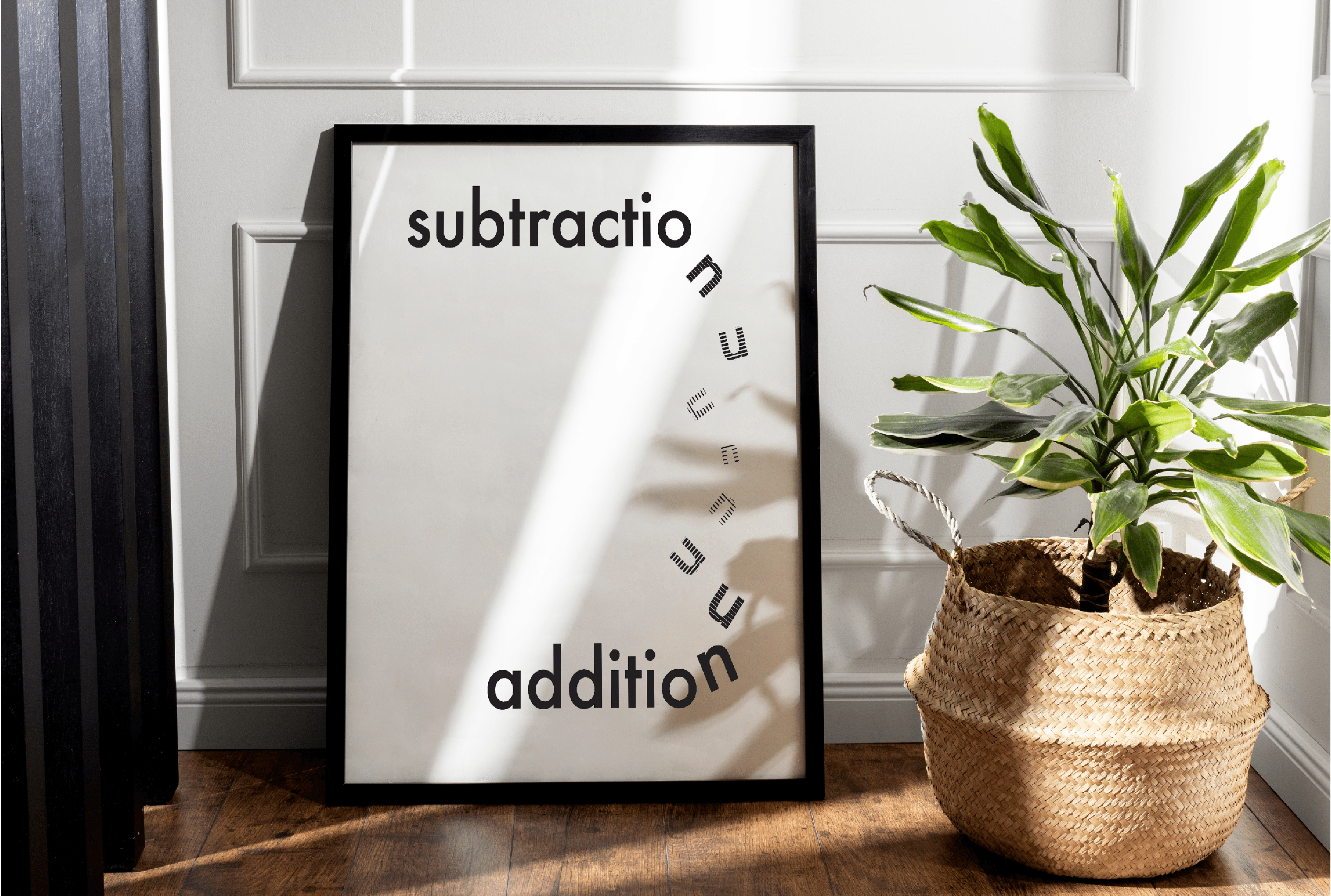
SUBTRACTION vs ADDITION
Carl Dair, a Canadian designer, established key principles exploring typography’s relationship to design in his book Design with Type. He identified seven essential contrasts: size, weight, form, structure, direction, texture, and colour.
Using these contrasts, I created a visual poster defining the concepts of “subtraction” and “addition” with the Futura PT typeface, aiming to convey meaning through typographic contrast.
If you've ever argued over who gets the bigger side of the bed, discovered a mysterious trail of hair turning your hardwood floor into an accidental carpet, or waged war over the eternal up-or-down toilet seat debate - this poster series is made for you!
Because cohabitation is full of tiny battles... and the best way to win is to laugh first.
02
Sketches & Iterations

Figure 1: Sketches of ideas for the visual typography of the words "subtraction" and "addition"

Figure 2: Two design iterations for the visual typography poster
03
Final Design